
In January of 2018 I began a refresh of OTW Safety’s identity, marketing materials and website, focusing on high contrast visuals, clean lines, and bright colors to match a renewed emphasis on the engineering capabilities of the company and the high visibility products they produce.
Visual Style
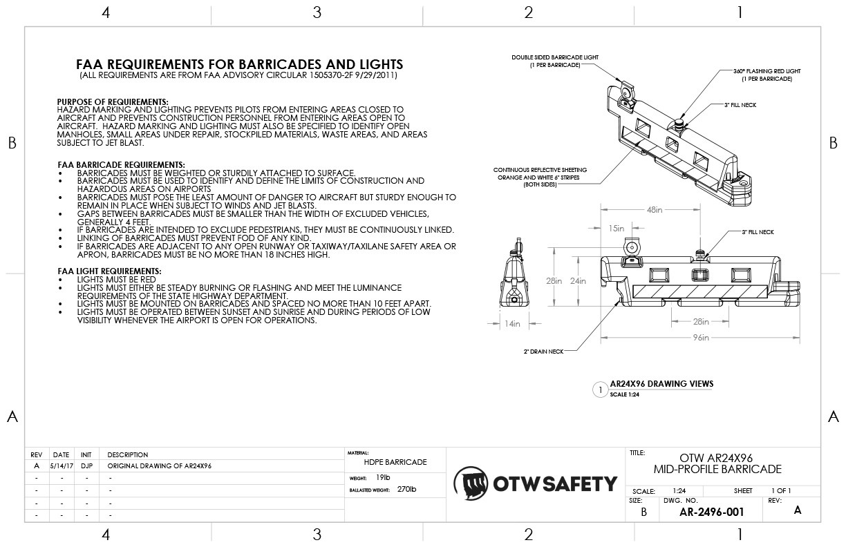
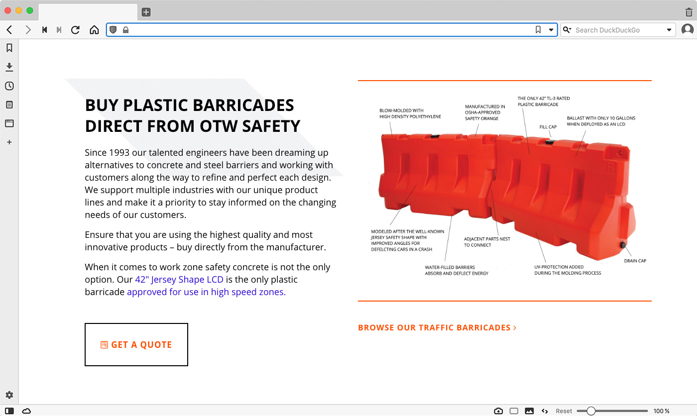
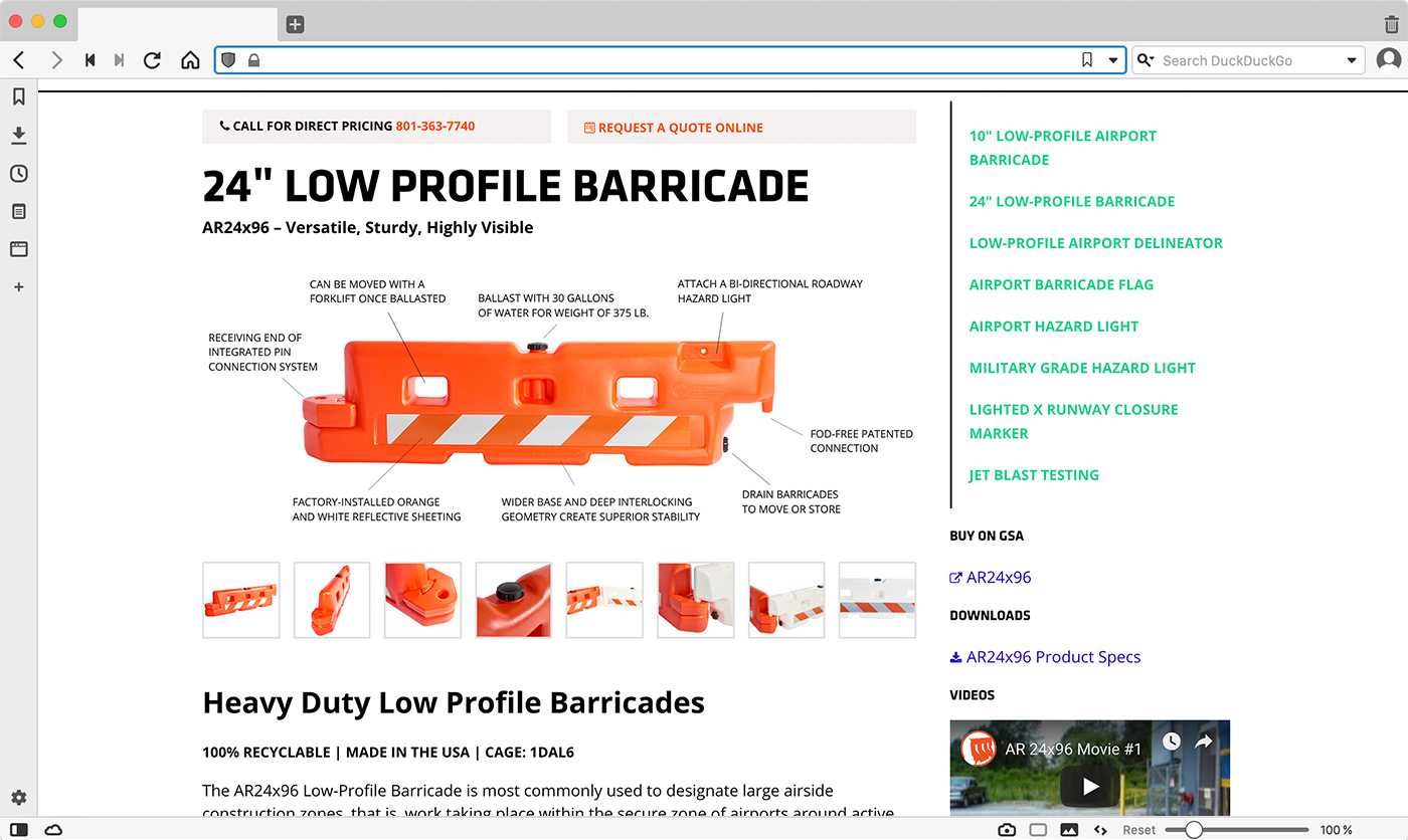
The new visual style was inspired by technical drawings of the barricades produced by OTW Safety. I used thin black lines, labeled graphics and a “safety striping” pattern that repeats throughout the site and on various printed materials. I also updated the color palette to complement the brands signature orange. Bright purple, green and blue replaced a more muted selection of blues and grays.


Website
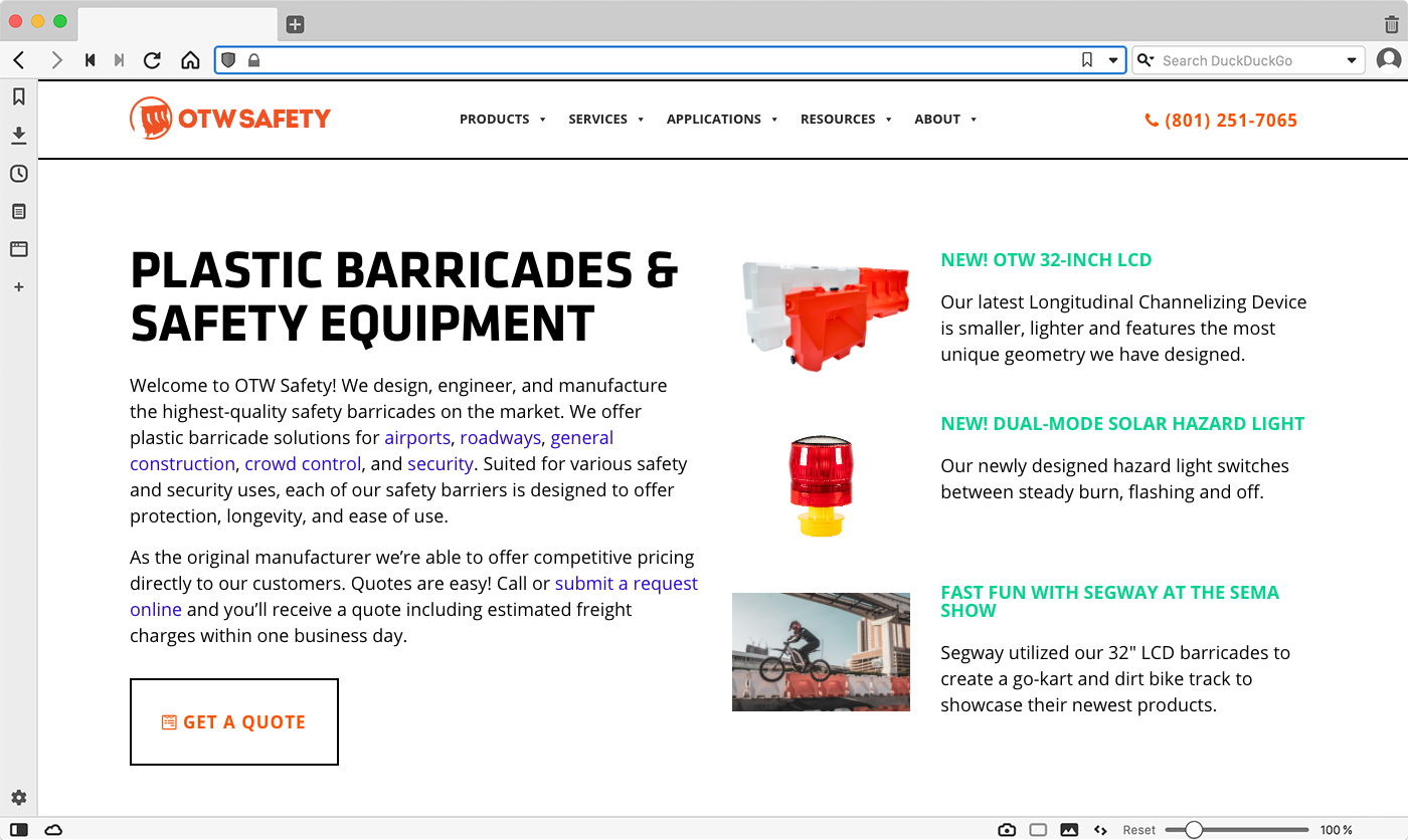
The website was a complete departure from the previous version. The site was migrated to Wordpress and all the page layouts were overhauled. I created a new site map that was integrated with keyword research, content planning and paid advertising campaigns.
Read about the redesign process
Read about the content strategy
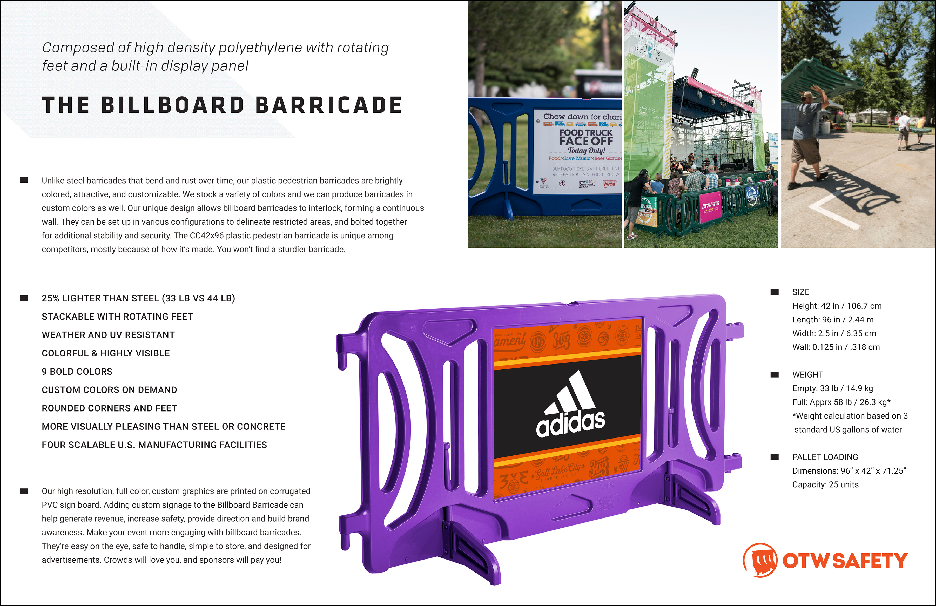
Photography
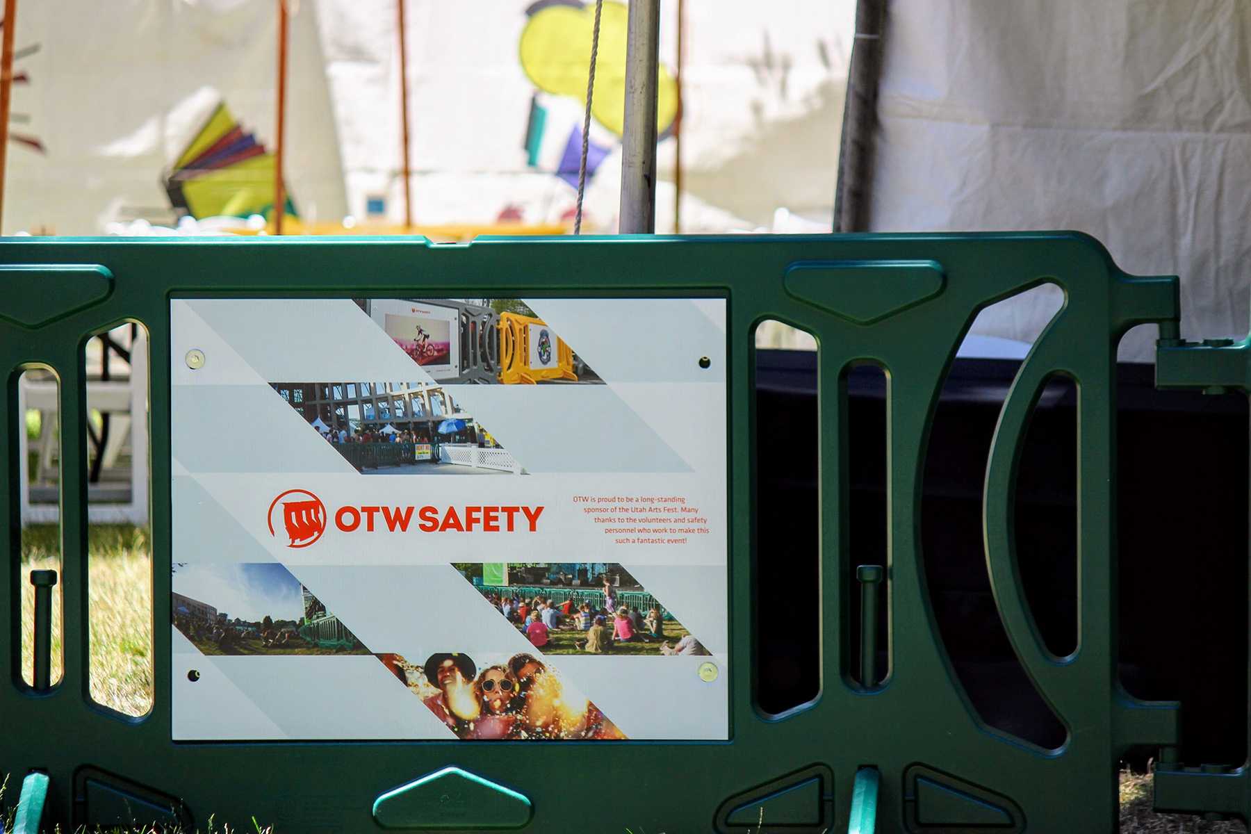
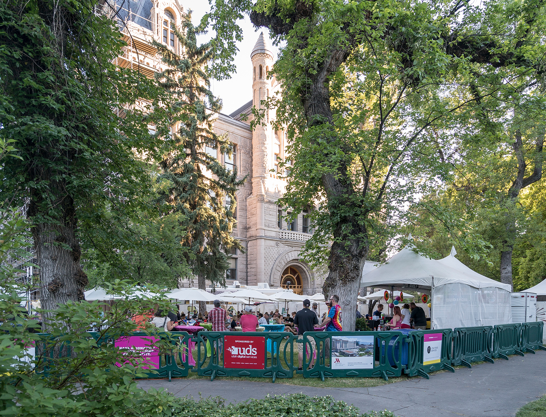
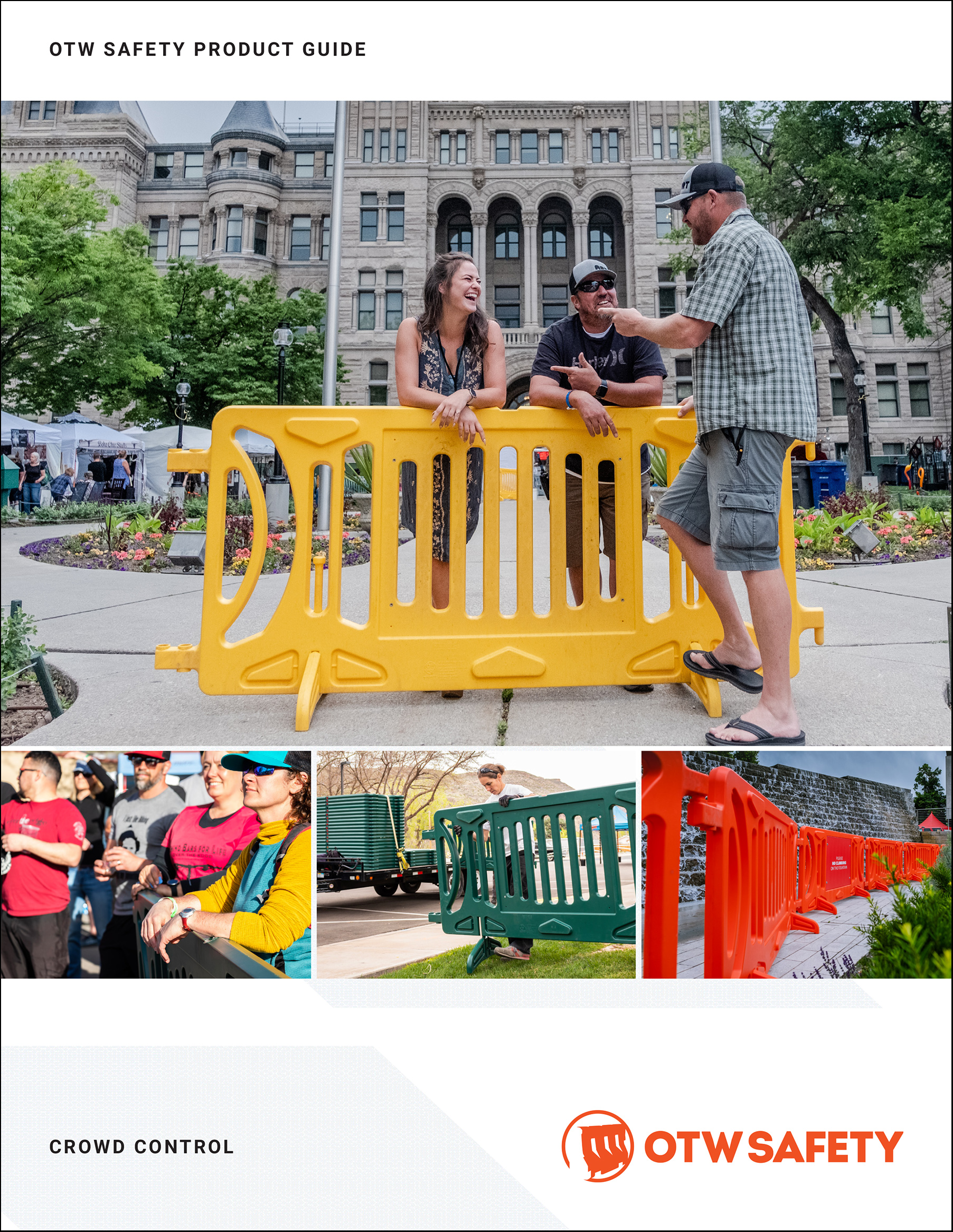
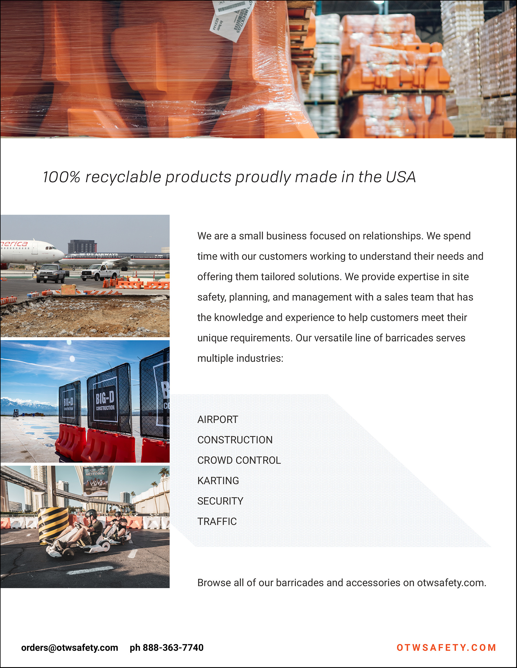
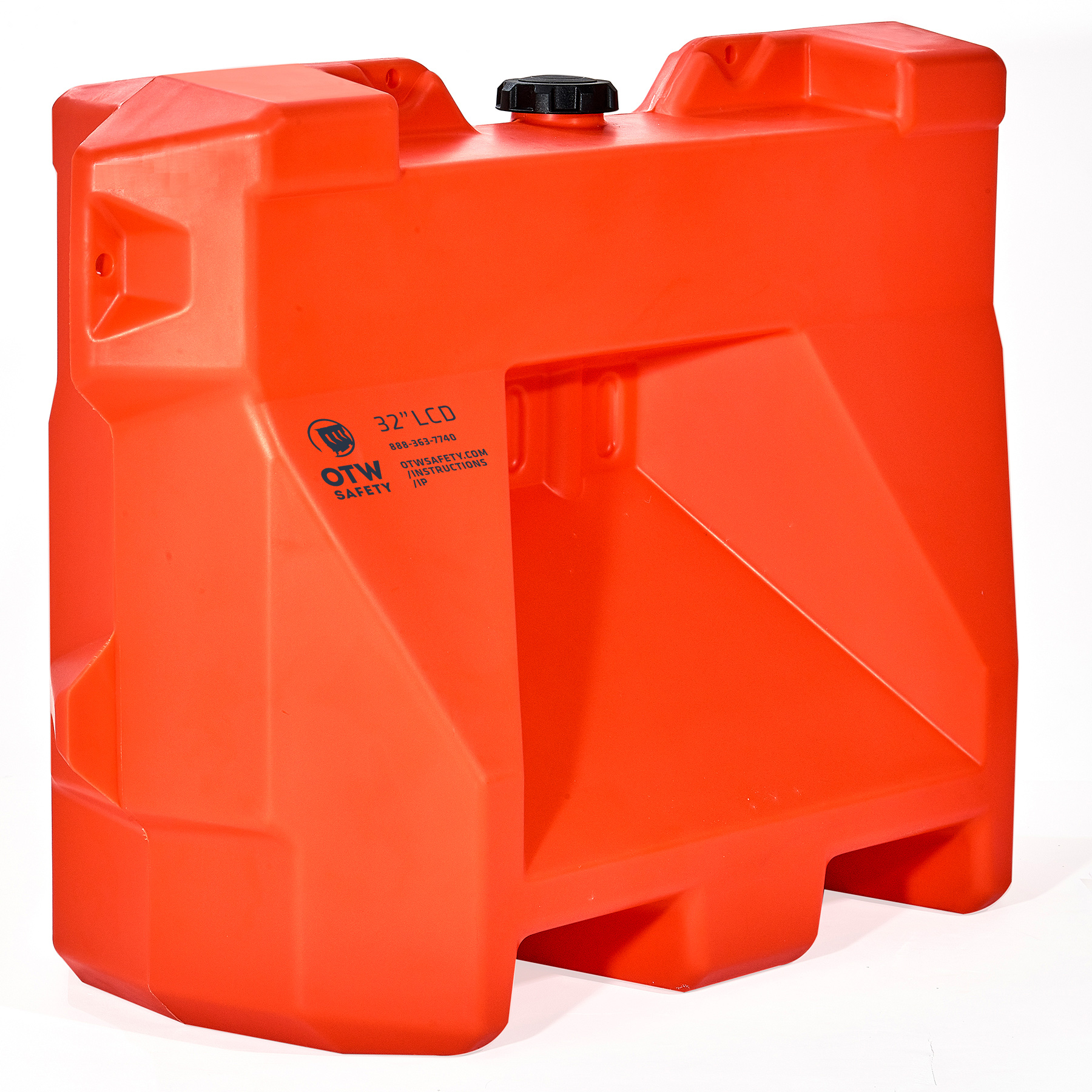
The new visuals included all new product and event photography that was vivid and colorful. Photography continued to be a marketing emphasis and over time we added more and more images to the library. Previous to this the company had relied on photos submitted by customers so the quality and variety was very limited.
Logo Evolution
For the logo, I kept the signature barricade mark but created a single-color silhouette and updated the letters to be a uniform size. The overall affect was a cleaner and bolder logo that didn’t sacrifice the brand recognition that had been built over time.
The original logo created in 1992:
![]()
The logo redesign I did when I started working for the company in 2014:
![]()
The 2018 logo refresh:
![]()
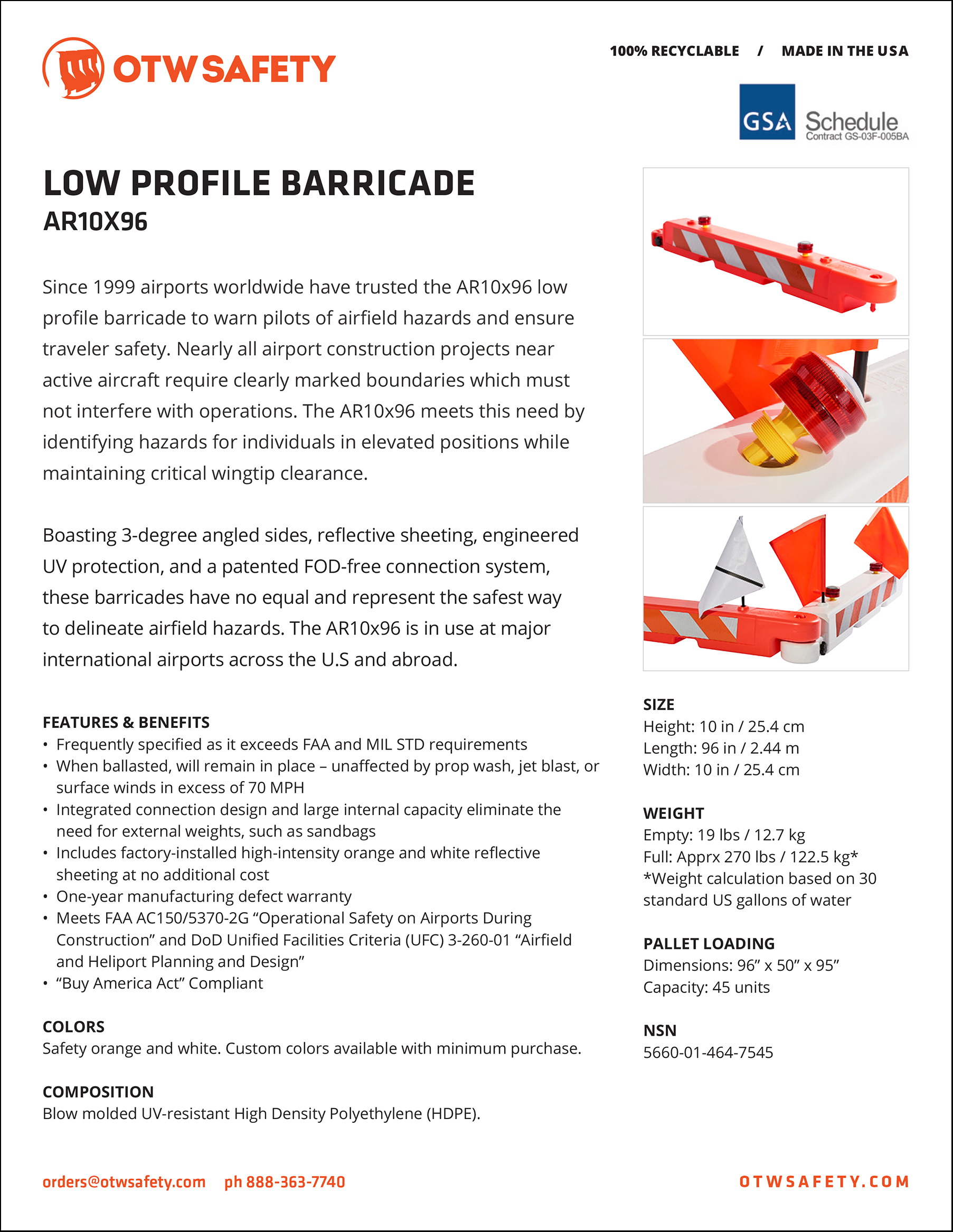
Product Sheets and Brochures
New product spec sheets and product guides replaced outdated versions. Again the emphasis was thin black lines, white space and close-up product photos.
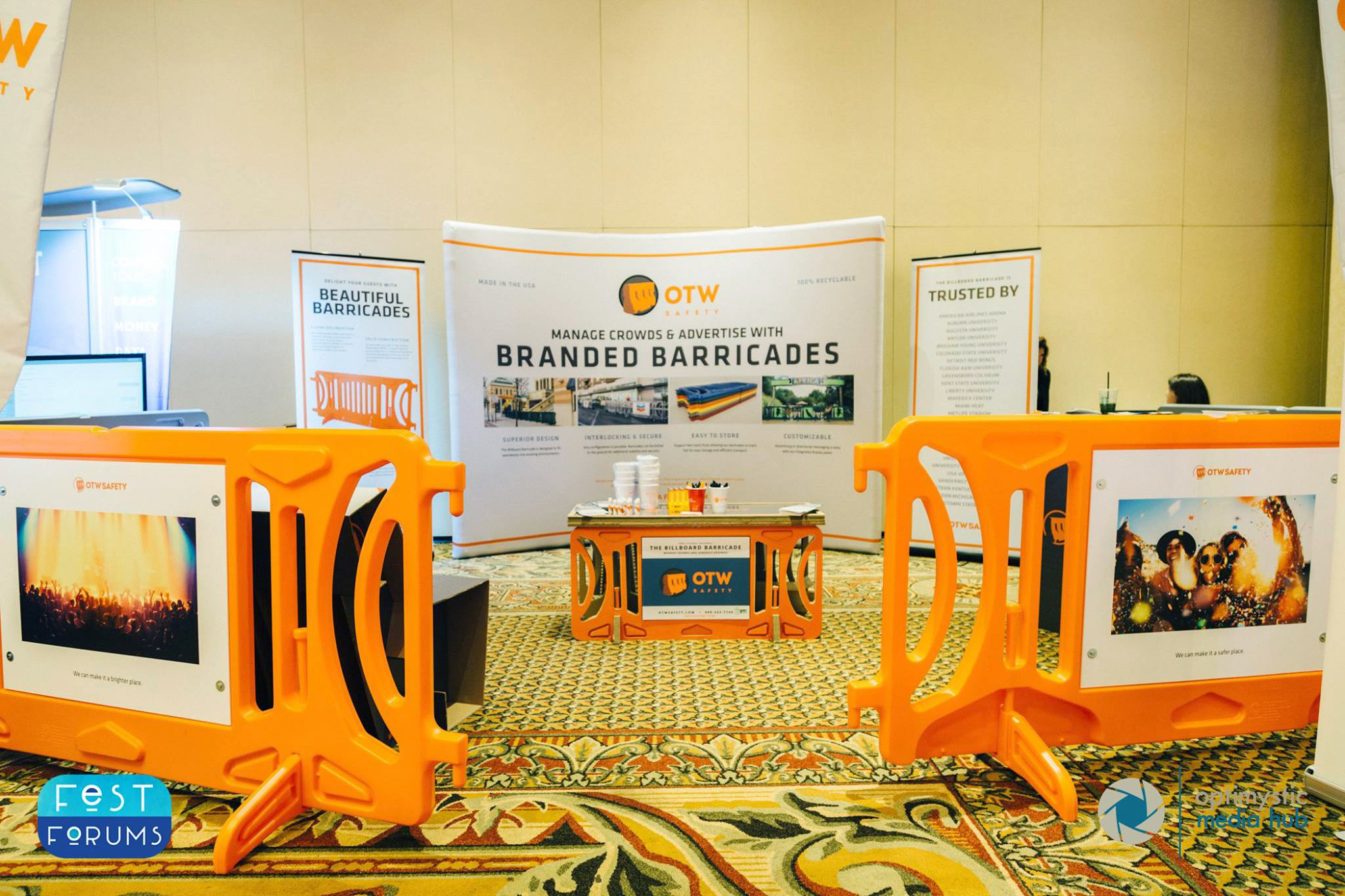
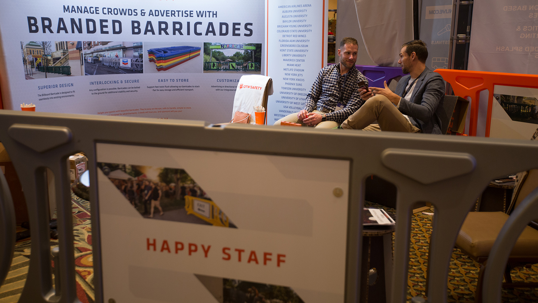
Signs and Displays
Conference displays and marketing materials were also updated – windscape displays and pull-up banners, branded cardboard furniture, unique signage for the barricades and all the shwag we could order.
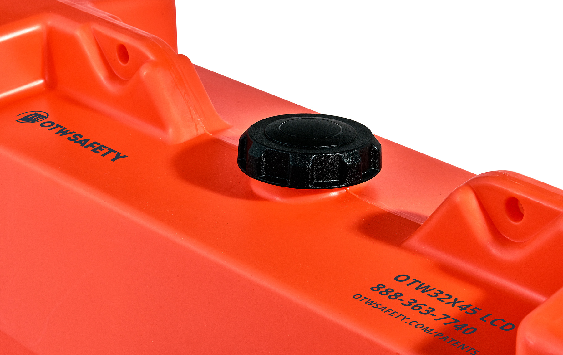
The new branding recently extended to the products themselves with mold-in graphics.
OTW has been around since 1992 and the branding has evolved since that time. As the Director of Marketing I made it a priority to get all the marketing and advertising materials up to date and consistent.