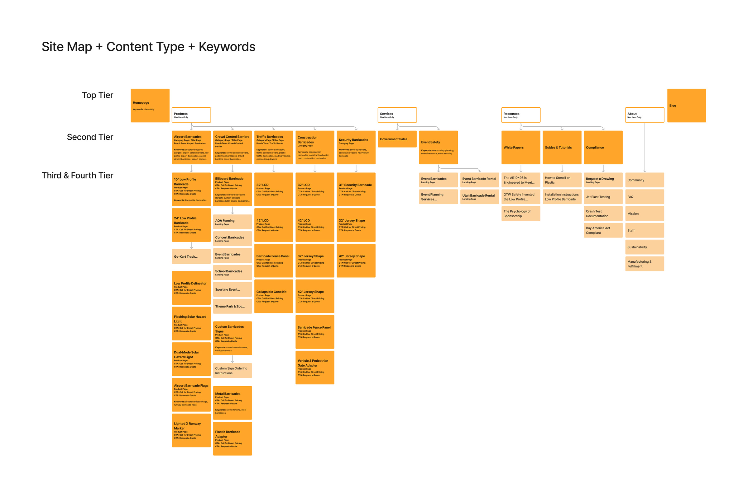
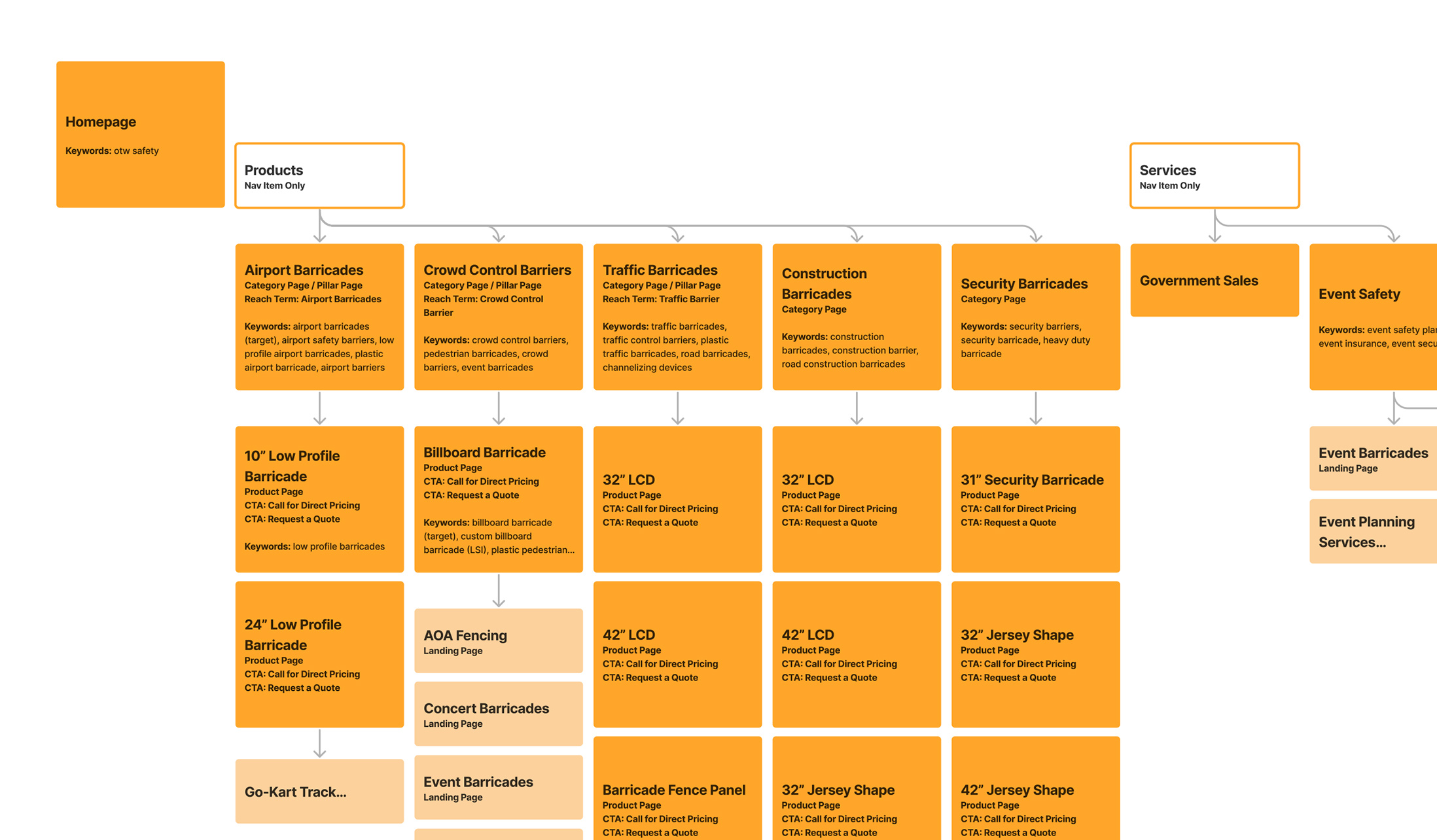
Site Map
Creating a new site map was the first step in this website redesign. We were migrating from LightCMS to Wordpress, redefining content types and page layouts, mapping a new content strategy to increase organic search rankings, revising paid search campaigns and integrating Hubspot to capture the source of leads and increase communication along the customer lifecycle.
The goal was to create content for specific types of users and establish OTW as an expert in the industry. Paid ads would complement the user-centric content and keyword research would unerlie both strategies.
The site map was designed in Figma and shows the top level nav, product pages plus supporting content, resources and company info. I added about 30 pages of content in this plan compared to the previous site.
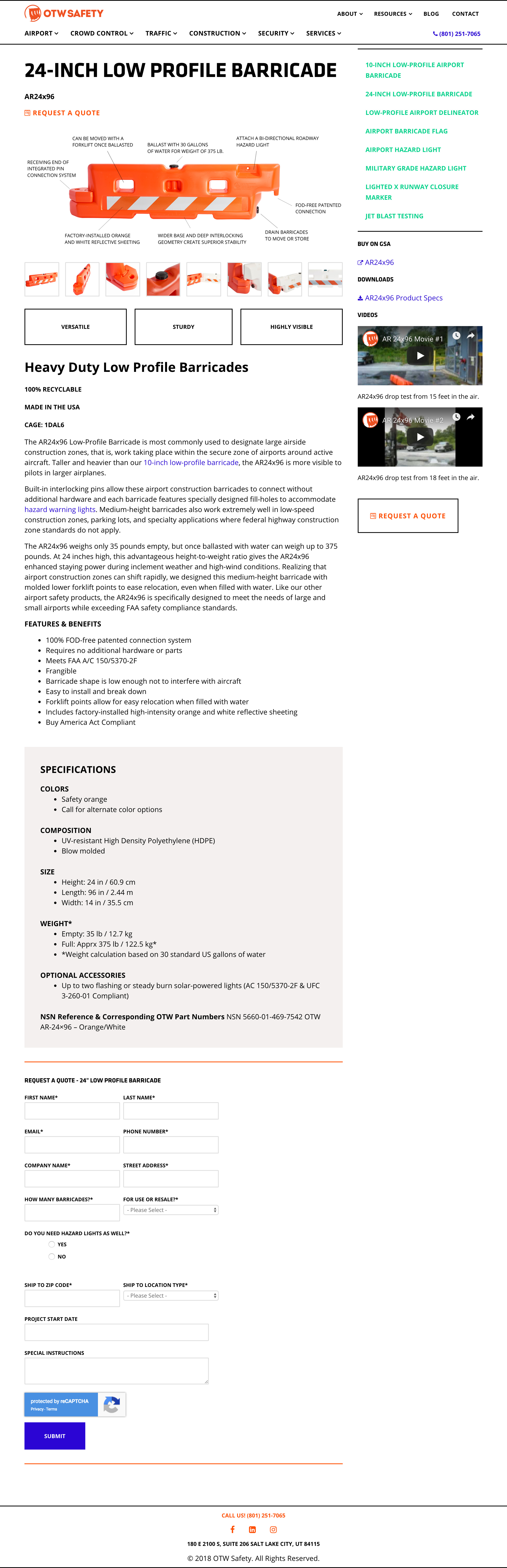
It was important to define early on which pages would be considered “pillar pages” – that is, broad topic pages with many links to related content. These pages would feature the most content, including images, videos, descriptions, specs, downloads, and links to use cases. These pages would target specific reach terms and be our most valuable lead generating pages.
I also defined page type in the site map so our development team knew which layouts were being used across the site.
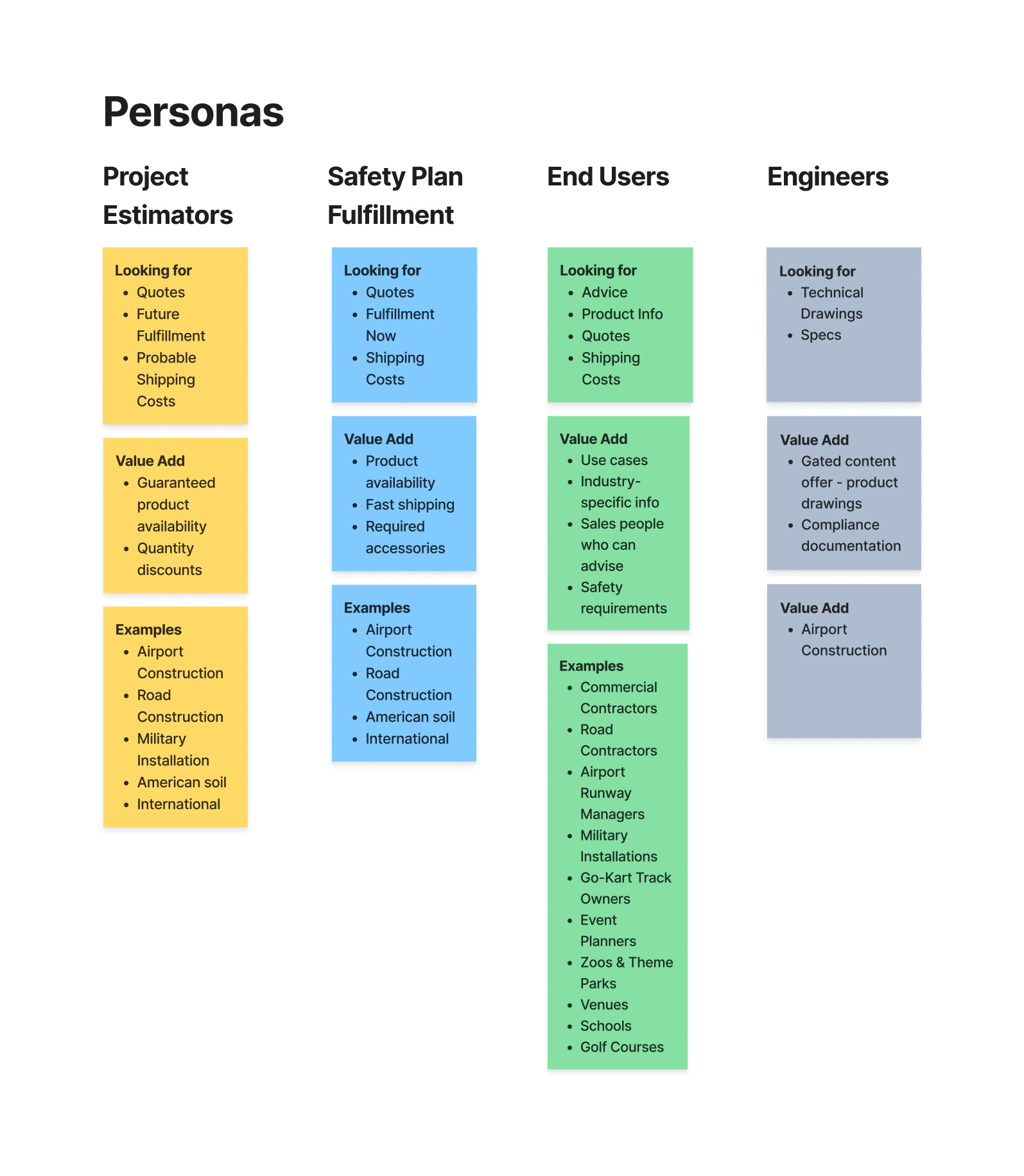
User Personas
Defining the target audience was a longer exercise because OTW serves so many different industries. I worked with the CEO, Director of Sales and our SEO specialist to define multiple personas. After brainstorming with the team I used Figma to create a visual reference showing broad user categories and more specific users that might discover OTW products as part of their normal day-to-day function.
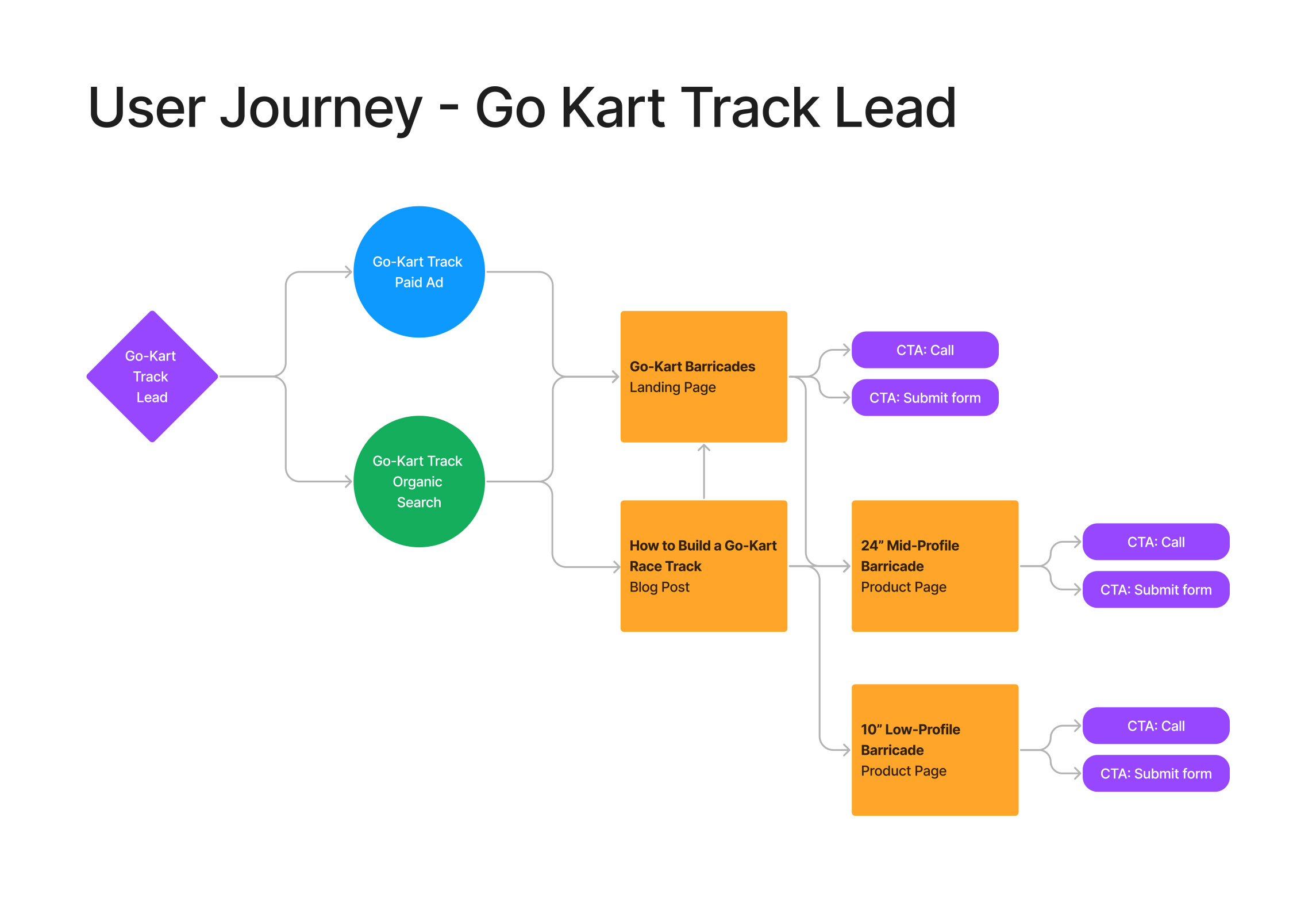
User Journeys
Again I used to Figma to create a visual map of the journey a lead could take from search or paid ad to completing a call to action.
Mock-ups
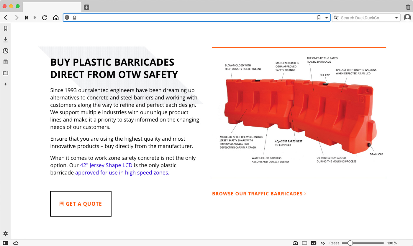
The new branding took center stage with the new website design. Klavika was used for headings and menu items and Open Sans was used for text. Thin black lines and a new safety striping pattern replaced the light grays and muted blues of the previous site. Bright colors used sparingly added contrast and visual interest plus complemented the bright orange color of the logo and products.
Evolution Based on User Behavior
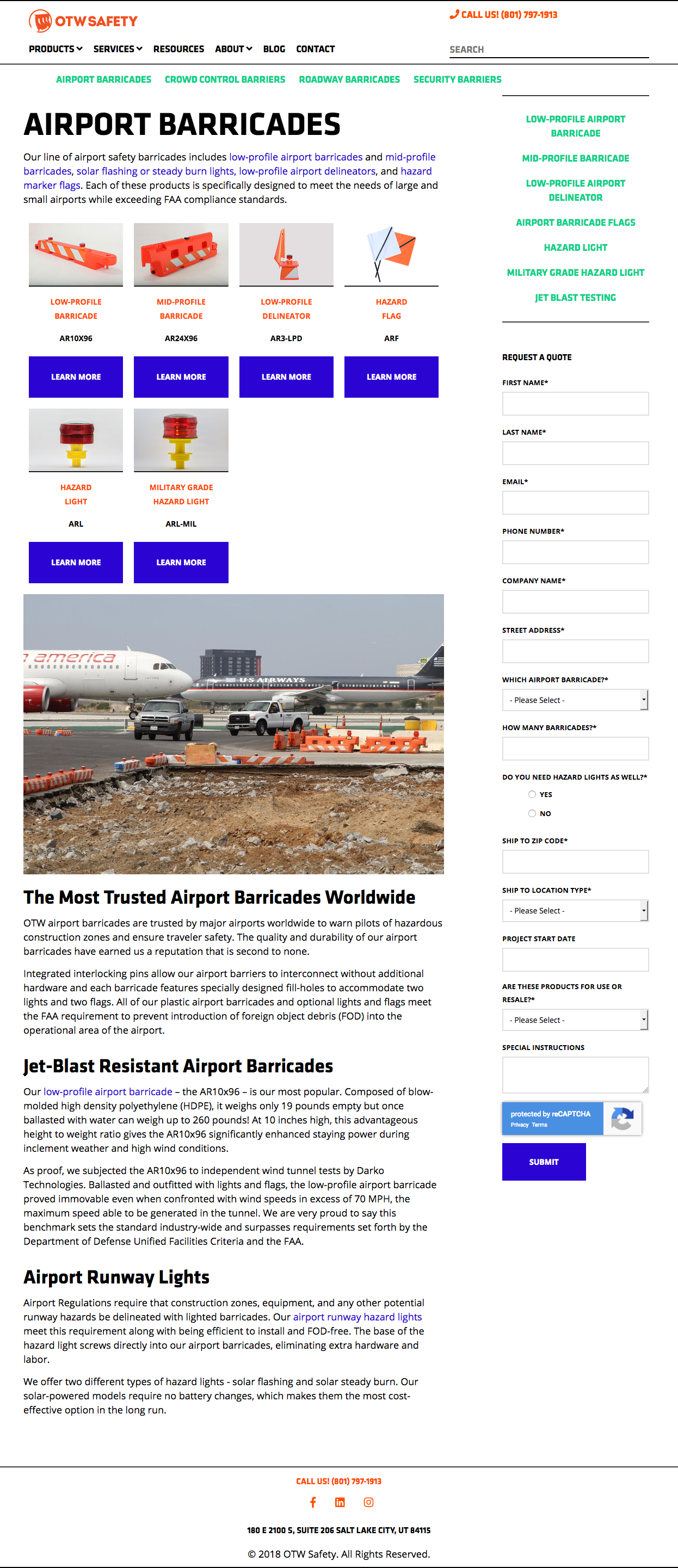
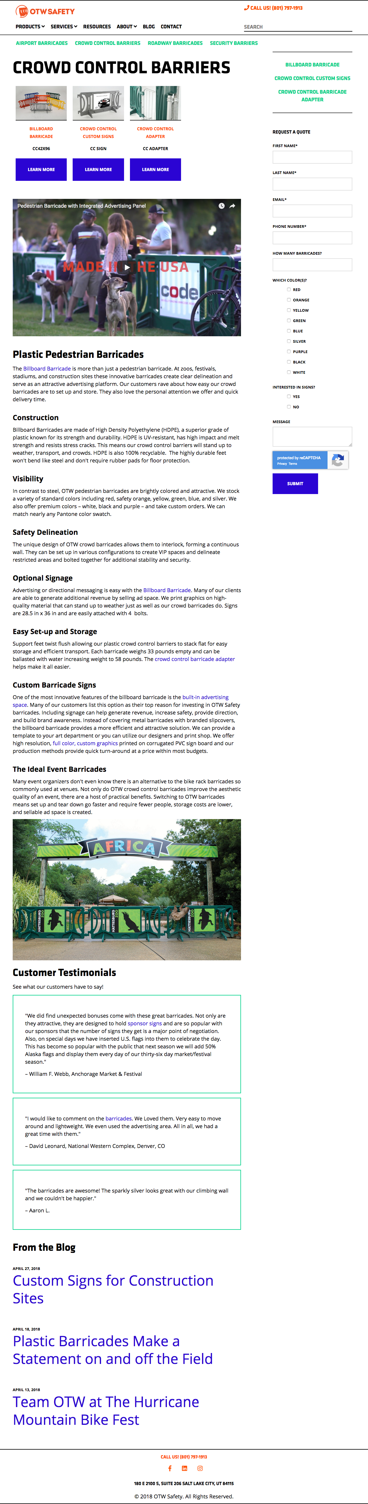
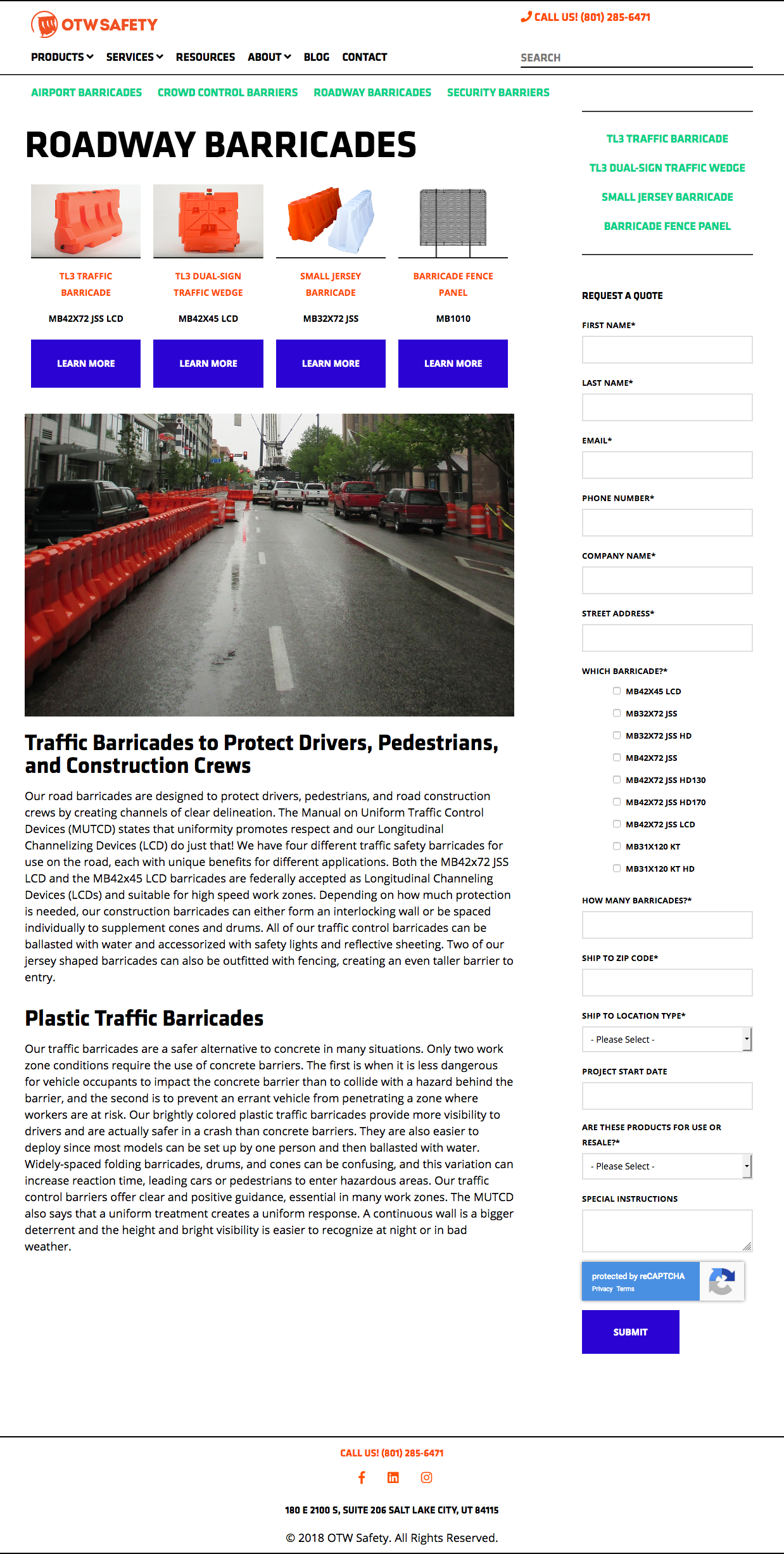
Once the new site was launched we used hotjar to examine user behavior on product pages. We made two important adjustments: adding more prominent calls to action above the main product photo and moving the form from the right column to the main seciton of the page where there was more room.
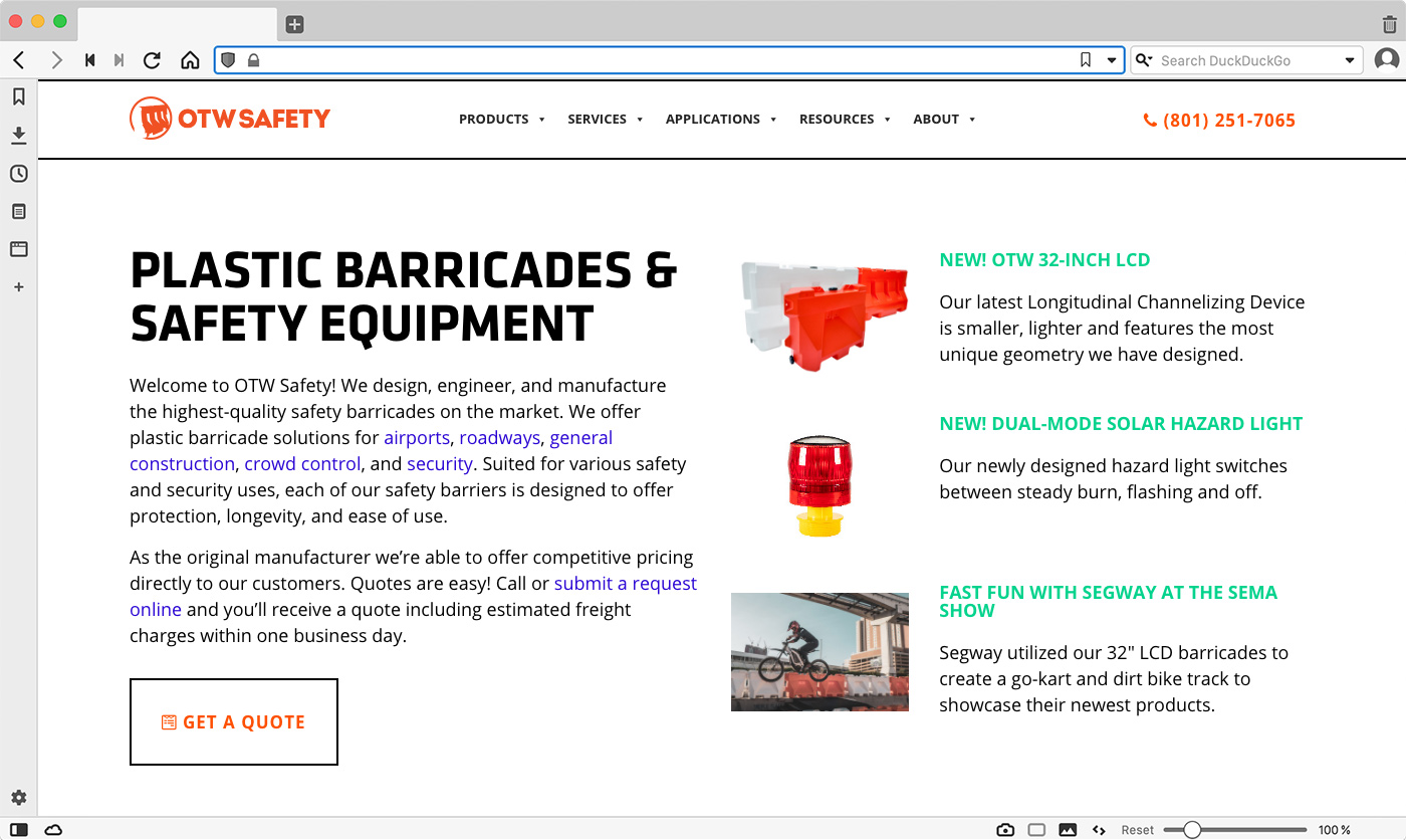
Featured News and Products were highlighted at the top of the homepage.
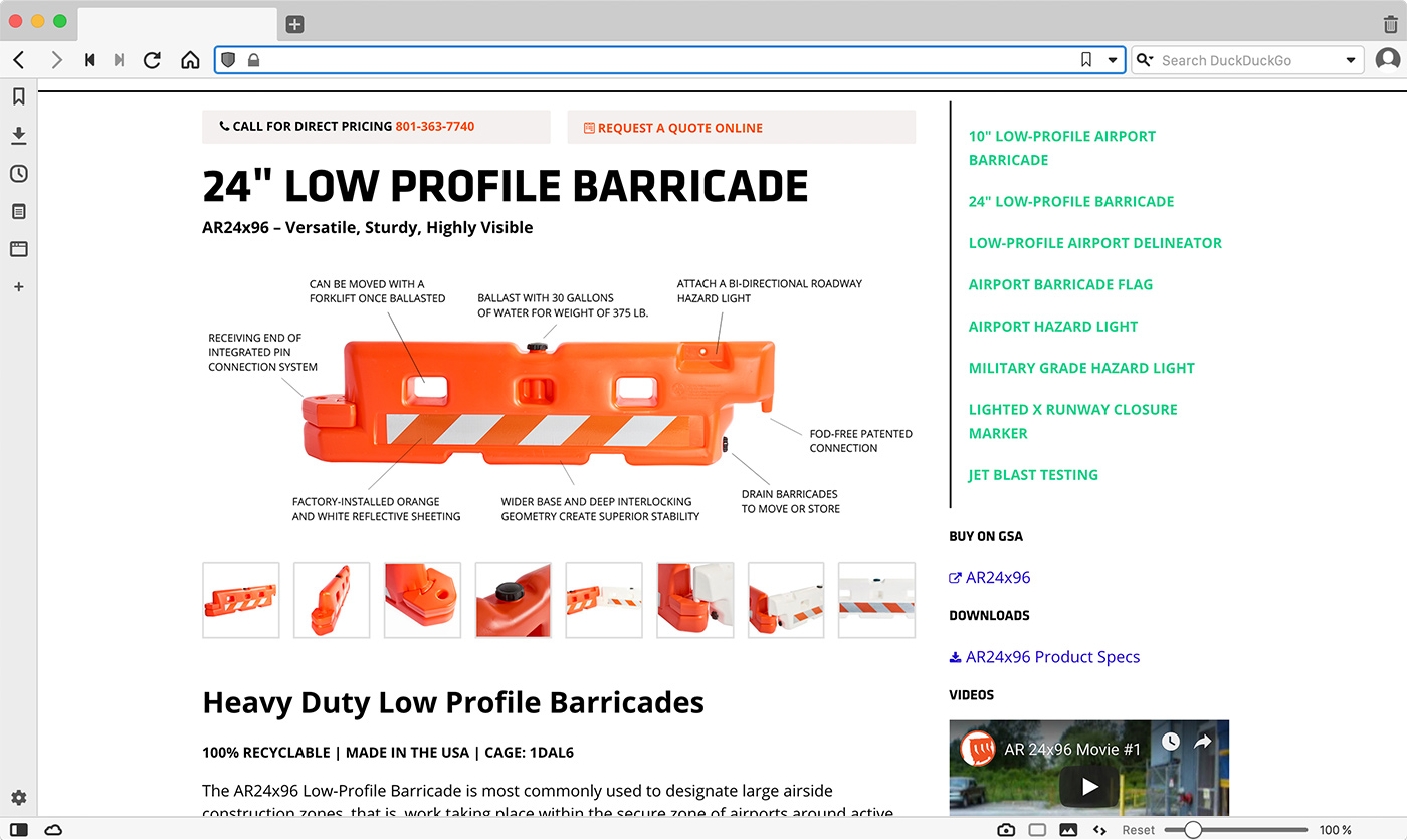
I created new graphics using new product photos and calling out important product features.
Calls to action were given even more prominence with buttons instead of text links.
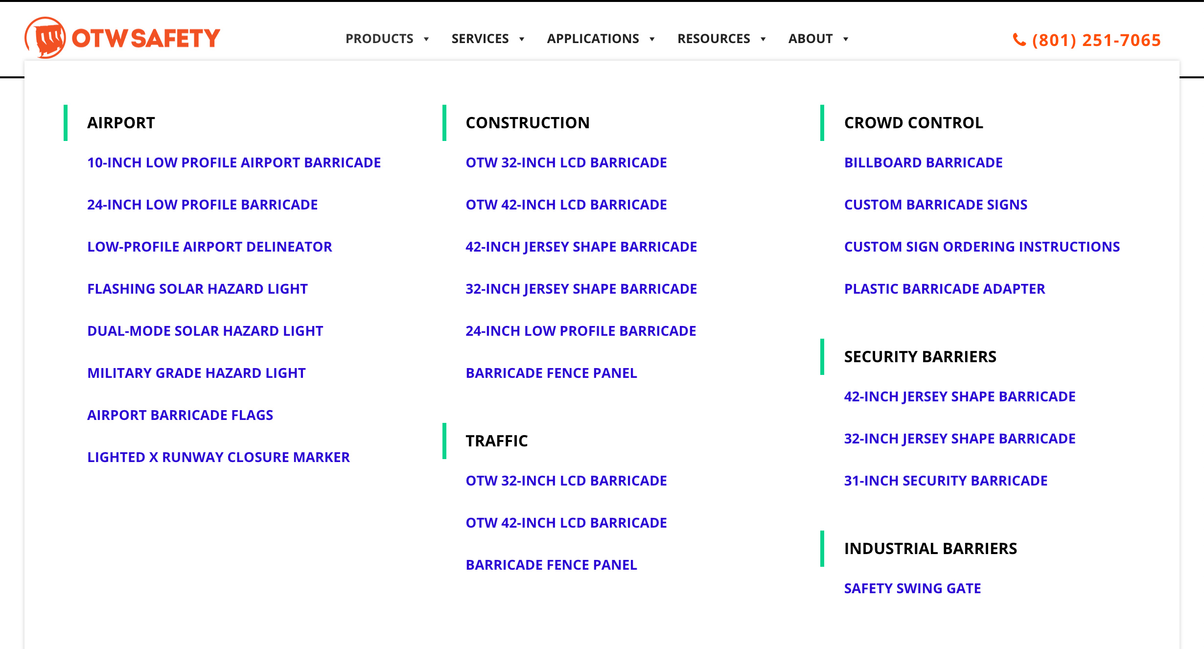
The amount of content grew so much we implemented a mega menu and footer menu.
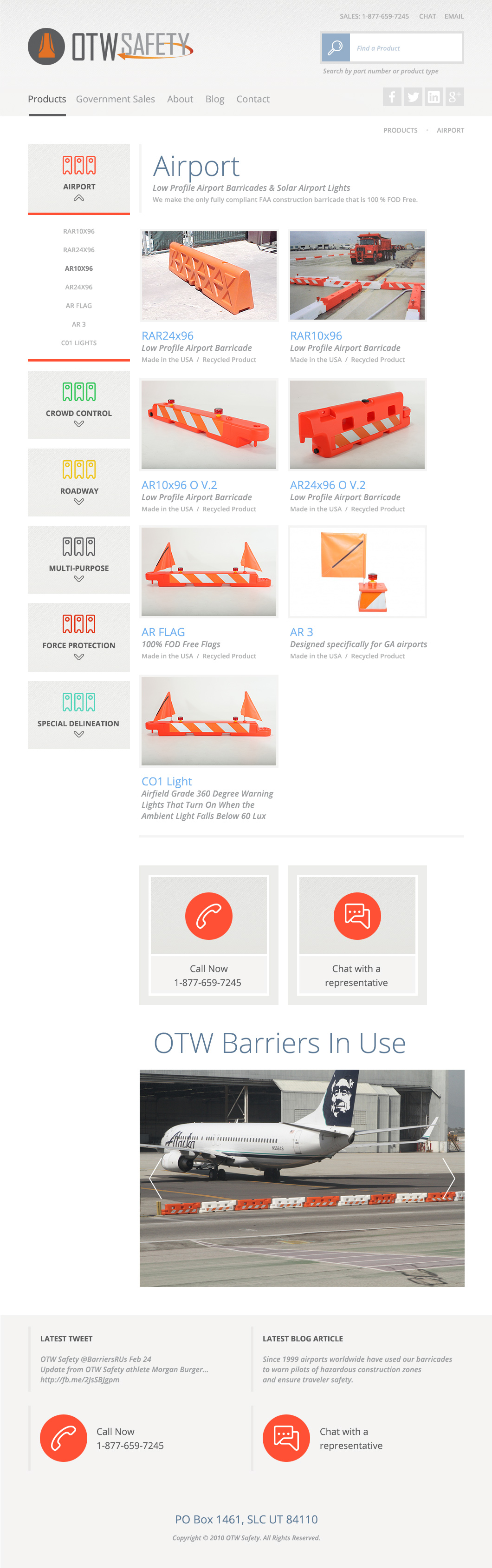
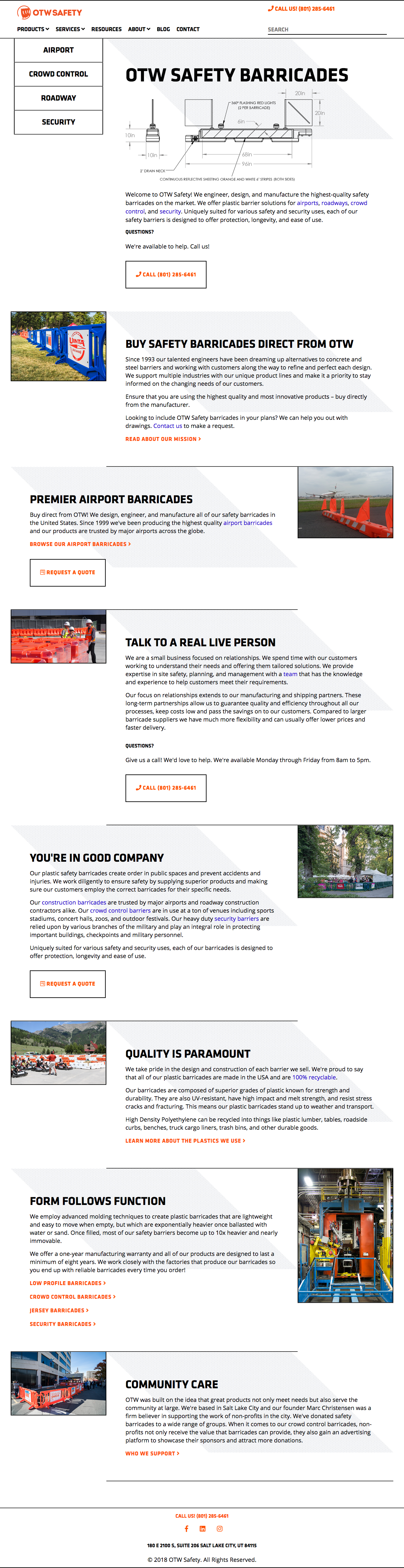
The Previous Site
A muted color palette, limited content and few calls to action were keeping lead generation stagnant. Upgrading the site platform, redesigning the visuals and integrating forms via the Hubspot marketing platform transformed the website, making the look and functionality much more current.