With over 500 portraits of PCT hikers to showcase, the objective with this book was to make the design disappear. We wanted to create a presentation format that was consistent enough to direct all the focus toward the portraits, but varied enough to keep the reader’s interest.
Vision
In early 2019 my friend Andrew Burns started a new Instagram account, @pct_people_project, to post the amazing portraits he was taking of PCT hikers in Southern California. As the year went on and he began traveling farther and farther from home to catch thru-hikers on various sections of the trail, the landscape and the condition of the hikers began to change. The faces, clothing, backpacks and stories were all captivating.
I talked to Andrew one day about how inspiring the series was – real people, all on the trail for different reasons but unified in many of their goals. He told me he had so many photos he was thinking about compiling them into a book. It would almost be like a year book for the hikers who were featured. I had just moved to Hawai’i and was pining for the mountains. I volunteered to help with art and design if he really went through with publishing a book.
Design Process
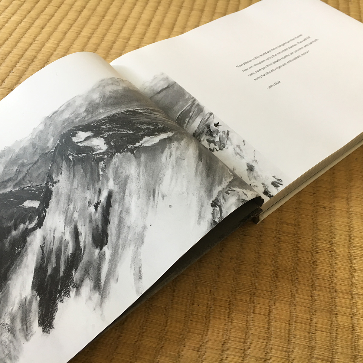
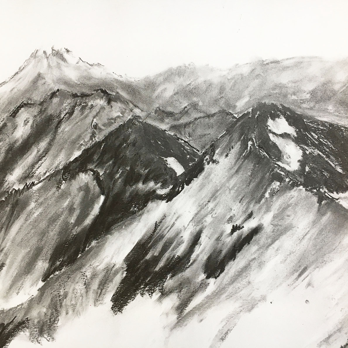
I began to experiment with different graphic elements and typefaces. Most of the ideas I had at the start ended up just being distractions from the real feature of the book – the portraiture. Still, Andrew wanted some other artistic element to the book, besides just the pictures. I decided to do some sketches of different passes on the trail and finally struck on the right complement. The high contrast charcoal drawings added a more rough, abstract feeling to the colorful and polished photos. Along with a few landscape photos peppered throughout the book, the drawings added scale and a chance for the reader to zoom out from the individual hikers and get a feel for some of the passes these people were taking on.
Once enough funding was secured to self-publish the book, the work really got started. There were huge zip files of photos to transfer, layouts to settle on, stories to link with pictures, and lots and lots of editing. Along with mapping out how long layout would take for 200 pages, I also needed high resolution scans of the 22 x 20" charcoal drawings I had made.
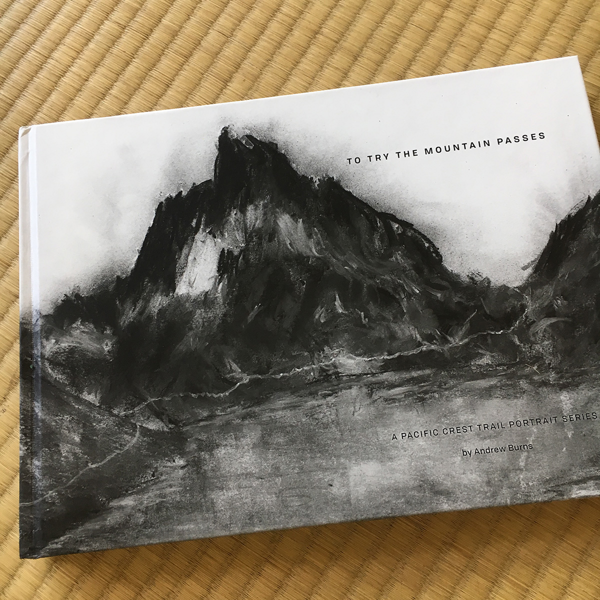
The title of the book, “To Try The Mountain Passes” is an excerpt from a well-known John Muir quote:
“Few places in this world are more dangerous than home. Fear not, therefore, to try the mountain passes. They will kill care, save you from deadly apathy, set you free, and call forth every faculty into vigorous, enthusiastic action.”
This was the centerpiece of the project and what we returned to throughout the process. Getting the final files to the printer on time was my personal mountain pass and “Fear not!” became one of my mantras.
Collaboration
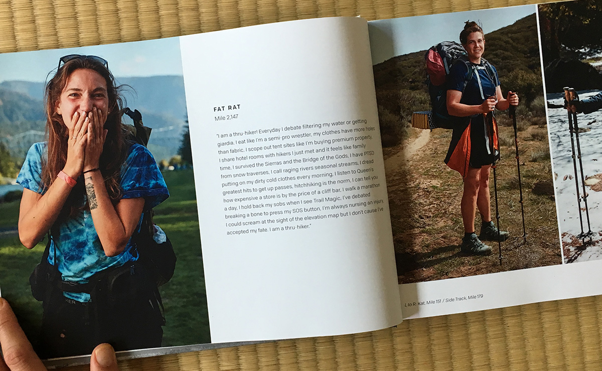
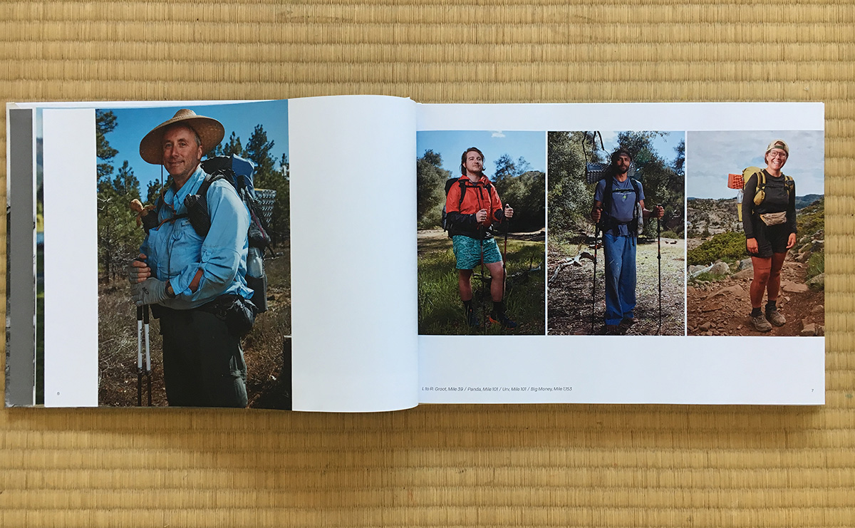
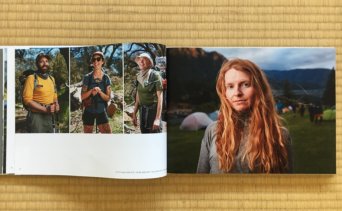
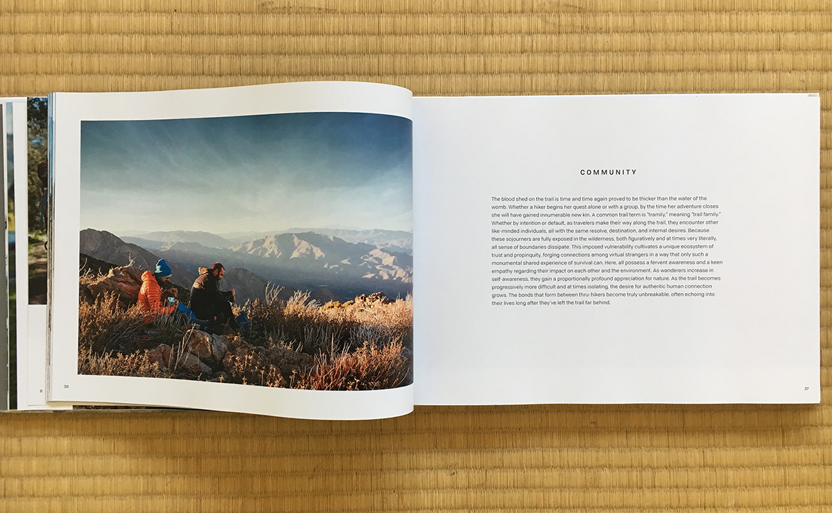
Collaborating with Andrew on the layouts was one of the best parts of the project. I wanted a gallery style with minimal type and lots of white space. Andrew agreed on the concept but wanted some spreads to be full bleed and pushed me to find a few different layouts that we could mix and match depending on the hikers featured and the composition of the portraits. We also wanted to feature the trail names of each hiker along with how many miles they had hiked when their portrait was taken. Instead of labeling each photo we decided to keep them at bottom of each spread like a footnote. This kept the portraits free of clutter but was an easy reference for readers. The stories followed the same column structure as the portrait pages and this kept the grid of the spreads regular and predictable.
Editing and Printing
This project challenged me in all aspects of my design practice. From the style guide to the grid to the technical aspects of designing and editing so many layouts in Indesign. When color corrected photos needed to replace all the existing ones I insisted they be named exactly the same so they would update automatically in the spreads. It seems small but relinking hudreds of photos would have eaten up hours of design time. Edits to the text were managed with a shared spreadsheet much like I used to handle tickets at the end of a website project – when a hundred people have edits two days before the scheduled launch. Andrew handled the press checks on his own since the book was being printed in San Diego and I was working from Hawai’i. This was the most nerve-wracking part! Had all those edits come through? Were the all margins perfect? Was the color of the drawings and photographs going to come out right??
In the end the book printed on time and everyone who had supported the project got their books before Christmas. It was a feat and a piece I’m proud to have in my collection.
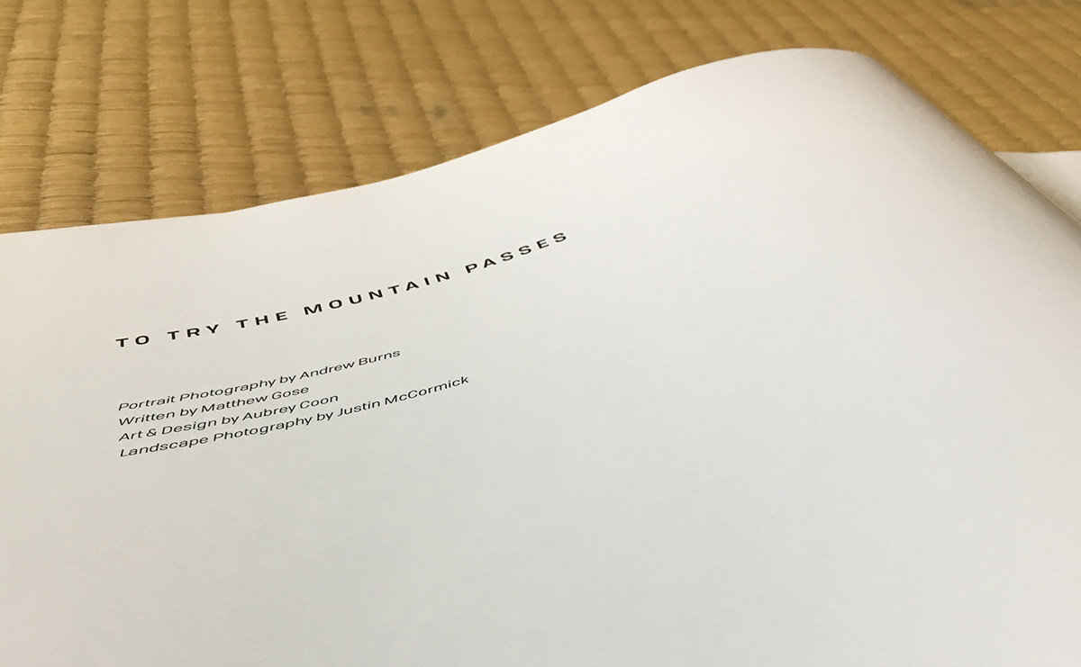
Andrew’s photography portfolio can be found at andrewburnsphoto.com