Logo Design
![]()
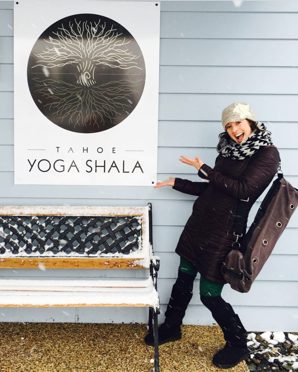
The finished logo for Tahoe Yoga Shala features a tree with branches stretched upward toward the sky and roots firmly planted in the Earth. Balance is important in the logo, as it is in the practice of yoga. The graphic was born from a desire to express the idea of opposite movements that complement each other while resisting each other. In the middle of the tree the still point is held in place by these opposing forces.
One of my favorite parts of design is taking one idea and expanding on it to create a series of related ideas. The central component could be a logo, a color palette or even a shape. A balance between repetition and variety allows brands to evolve while staying recognizable.
In developing marketing materials and advertisements for Tahoe Yoga Shala, we let the logo play a central role but experimented with different fonts and colors. Over a few years the logo itself evolved to stay in tune with where the style of the brand was going. The simplified version I created originally as a sticker design became the logo we used most often across new materials.
![]()
Studio Sign
Hoodies
![]()
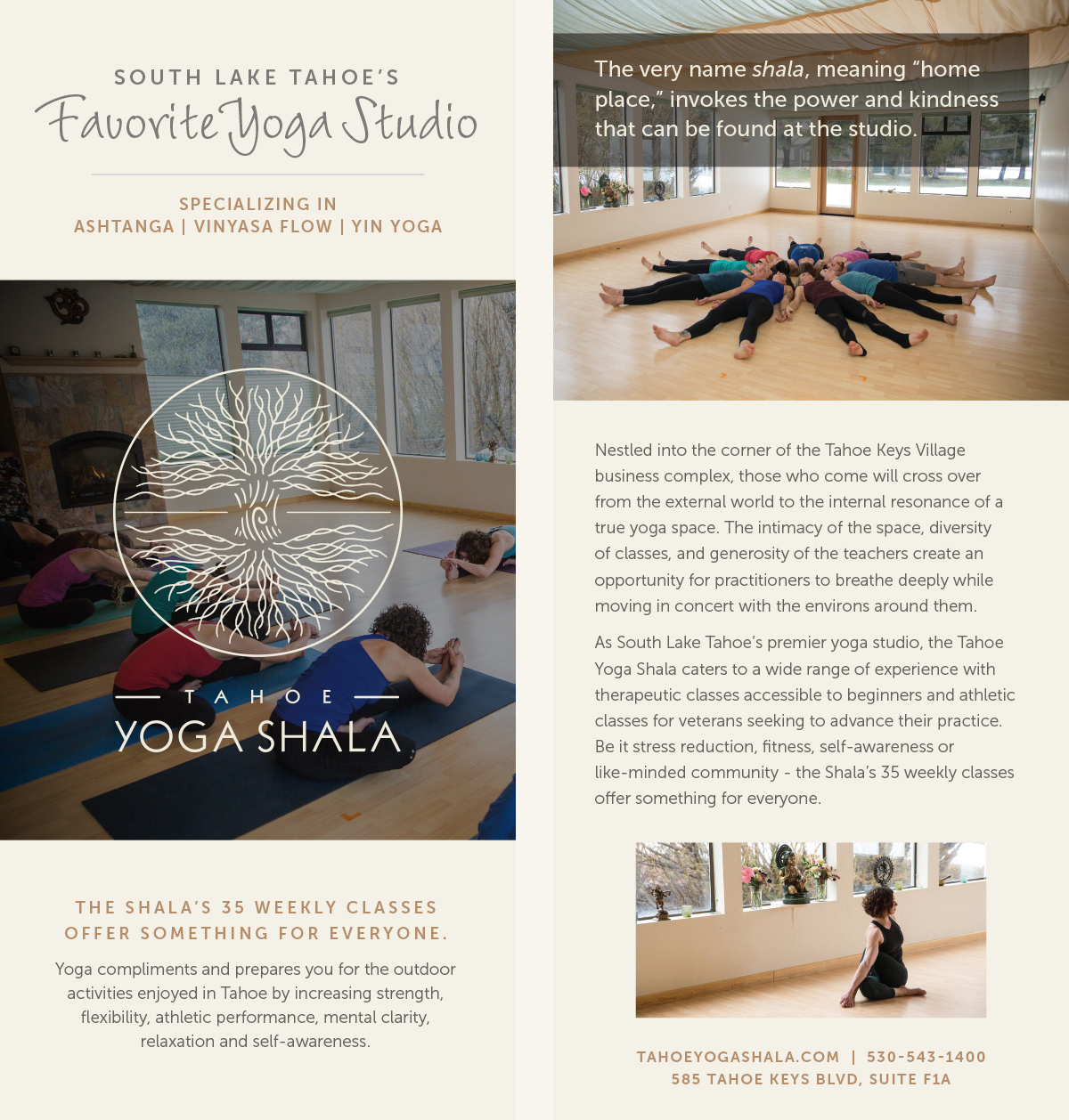
Rack card