Directive
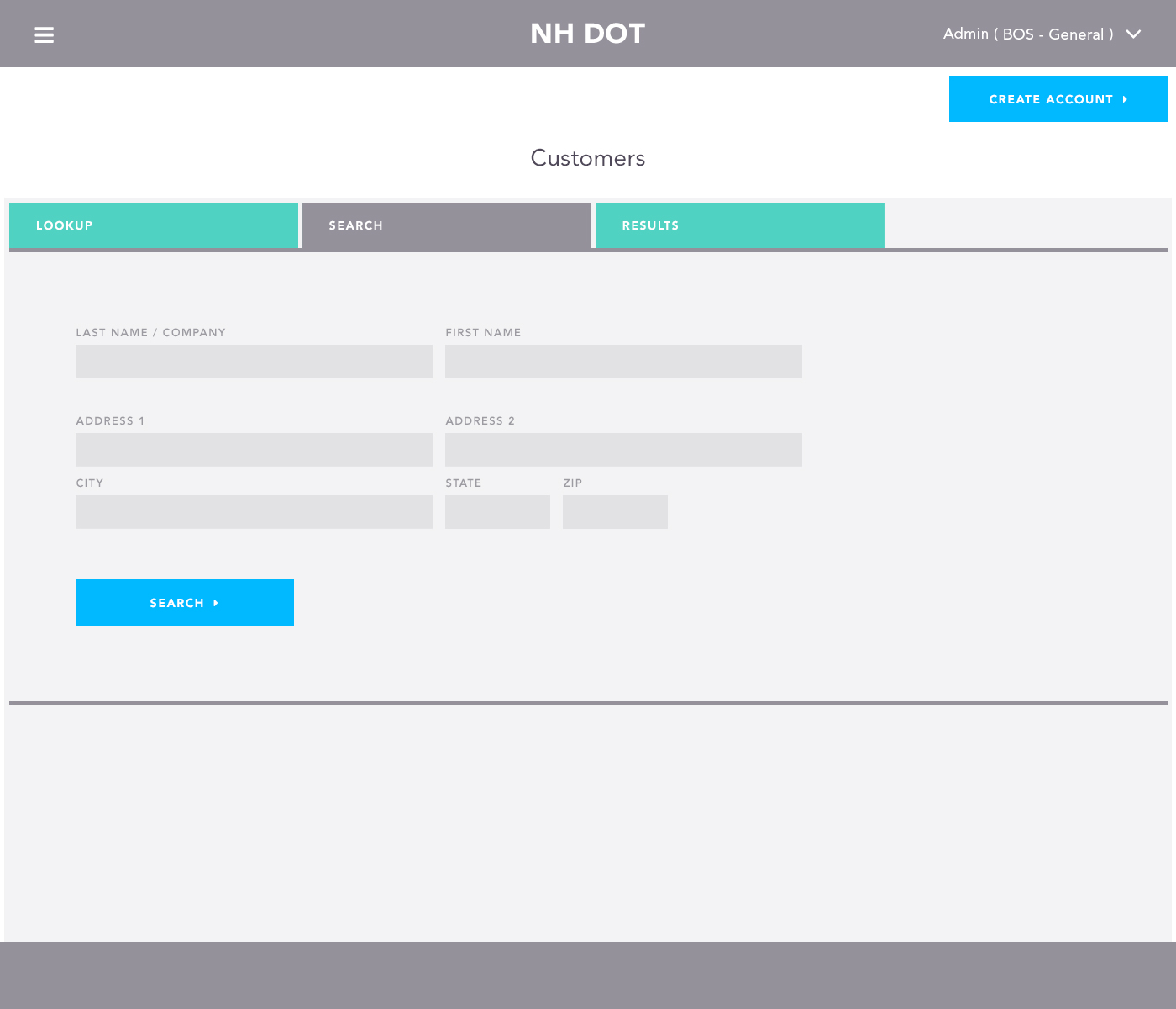
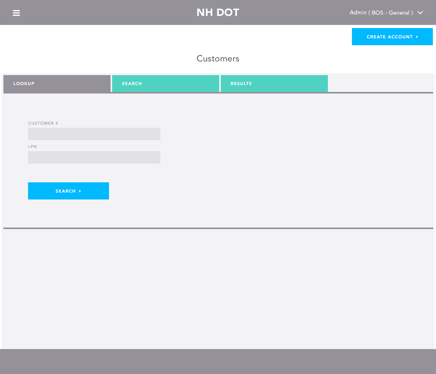
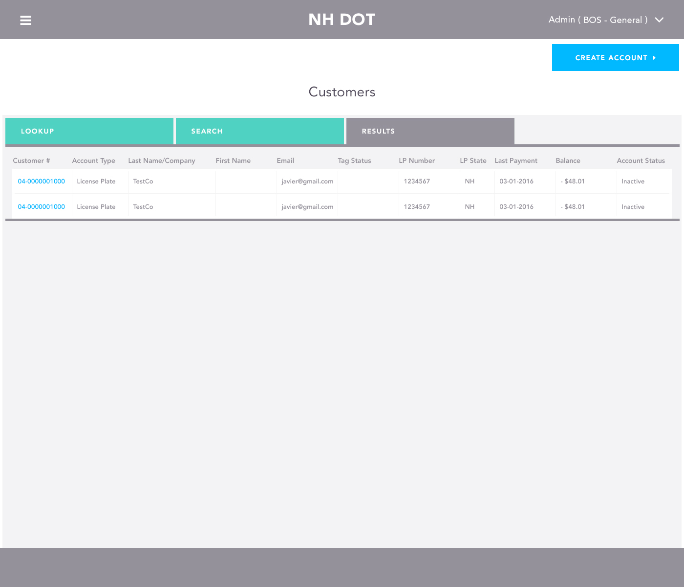
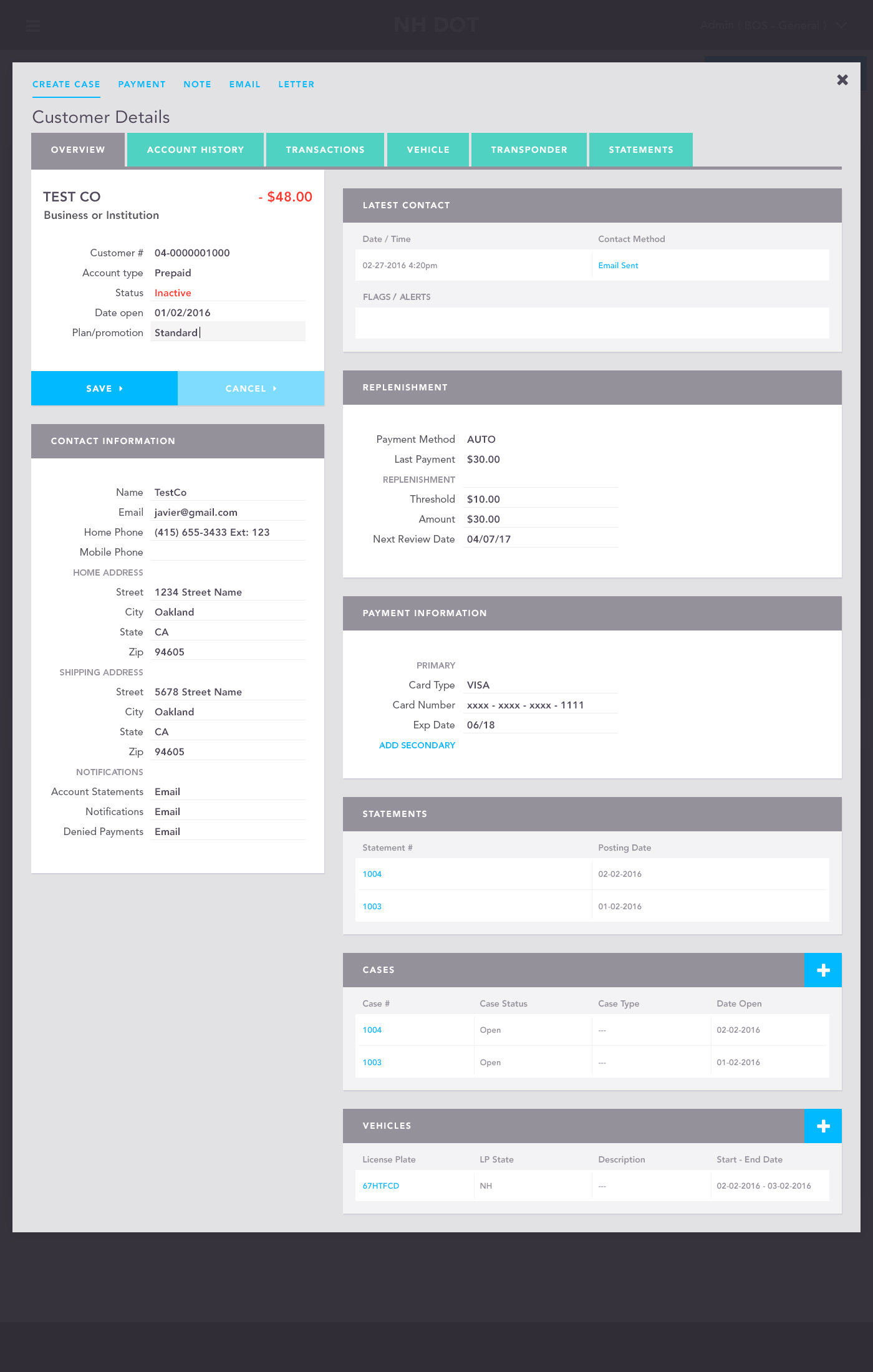
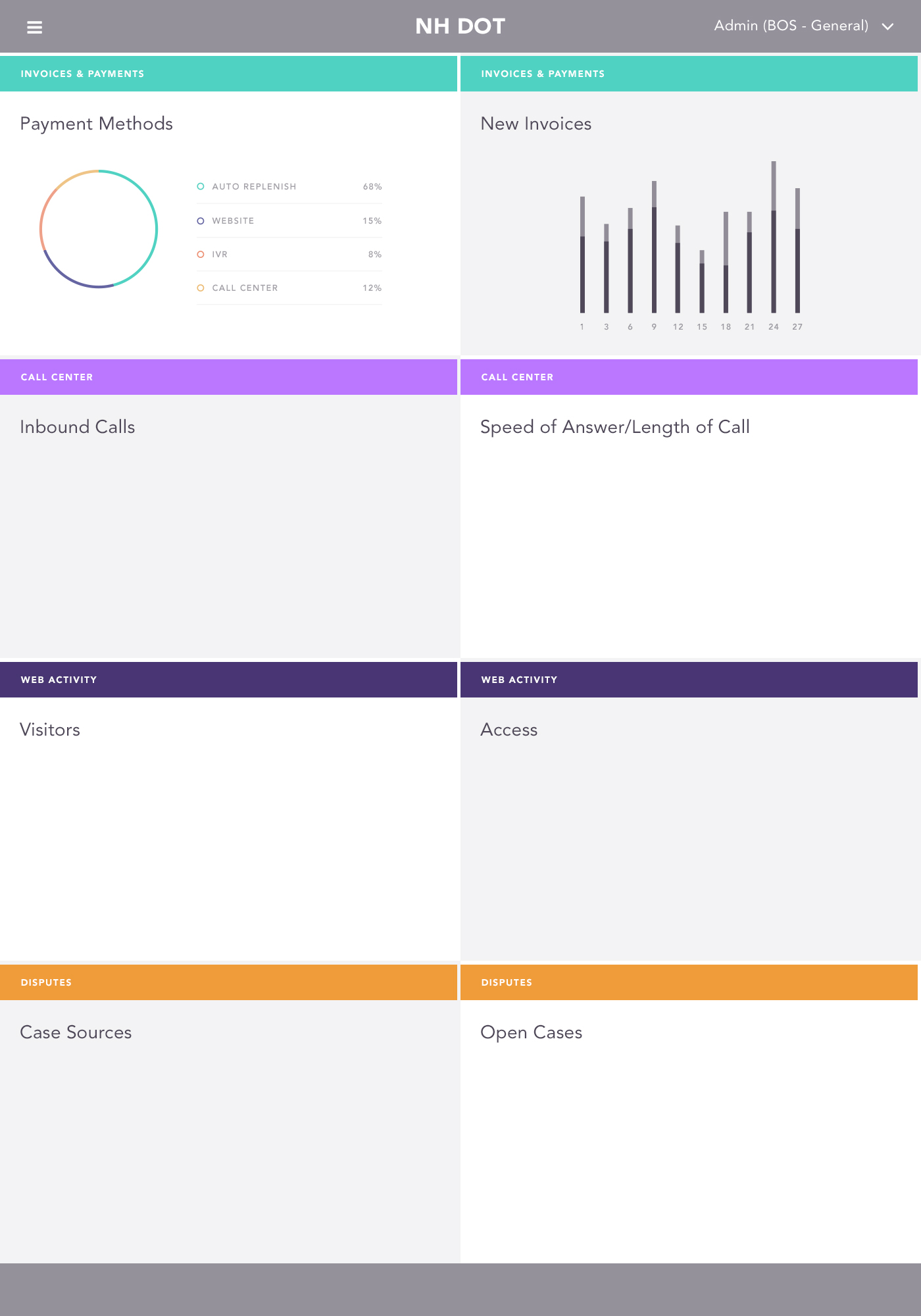
In 2016 I helped to create a series of layouts for a redesign project with the New Hampshire Department of Transportation, a client of ETAN Tolling. A few of my former colleagues were leading the project and they asked me to study the admin screens employees were using and see if I could make them more intuitive.
Recommendations
-
After reviewing the menu and pages I proposed a number of changes and set to work creating wireframes to be reviewed by the client. My suggestions were:
-
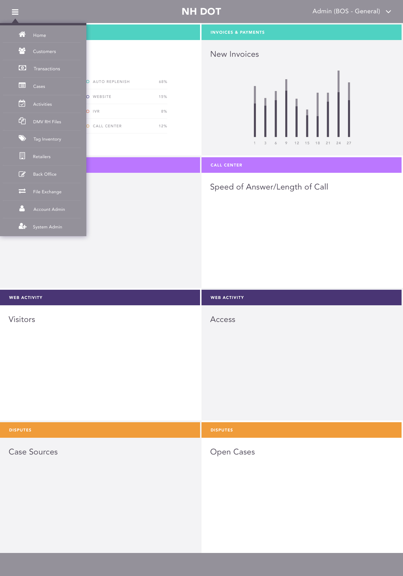
User nav (left pop-out menu) open by default when logged in and available on each page
-
Add sign-Up link back to top nav (this menu item is in AXURE but not on the site)
-
Add notes functionality on forms
-
Combine Account Home and Account Dashboard pages
-
Separate Statements and Recent Activity pages
-
Separate Invoices and Violations pages
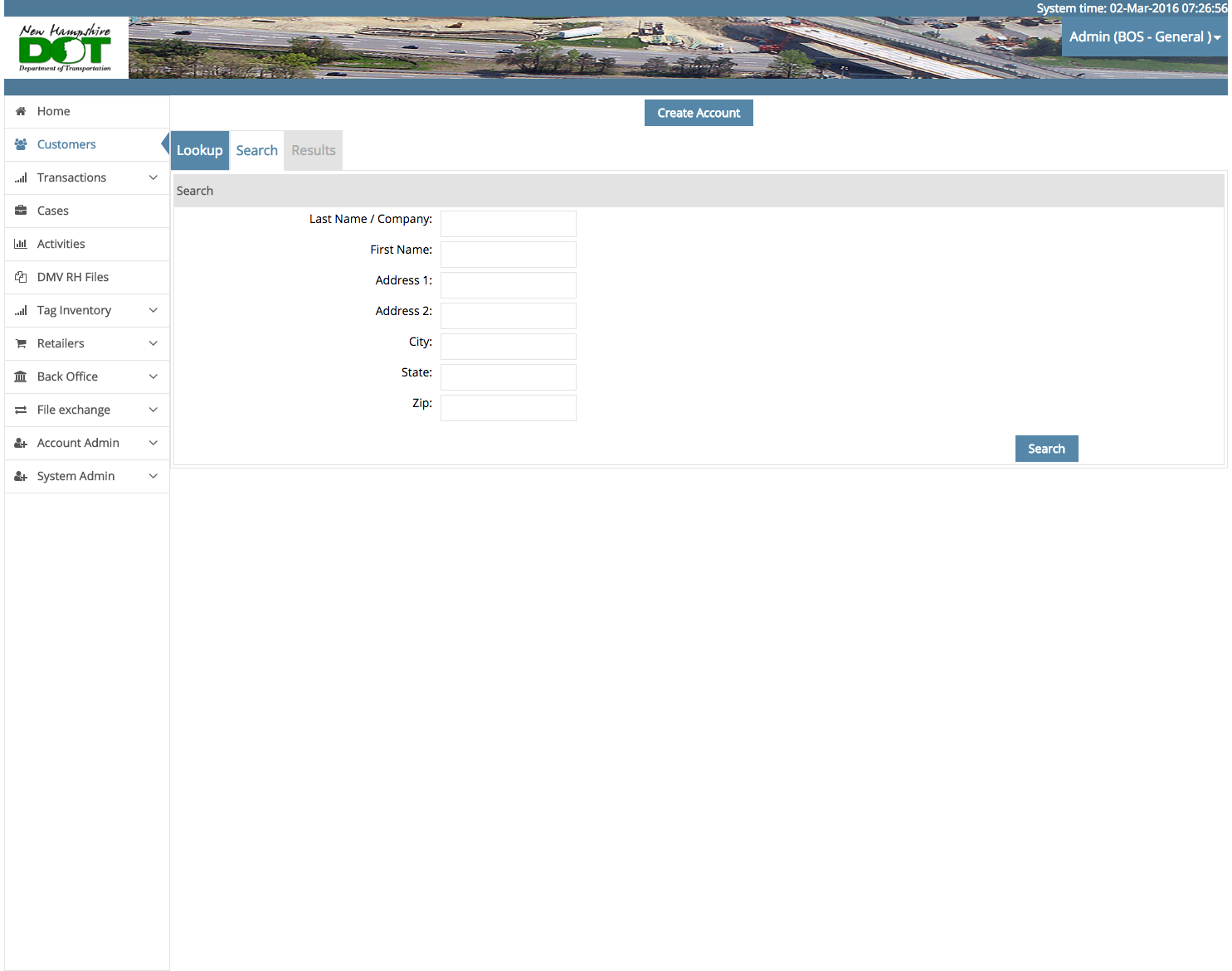
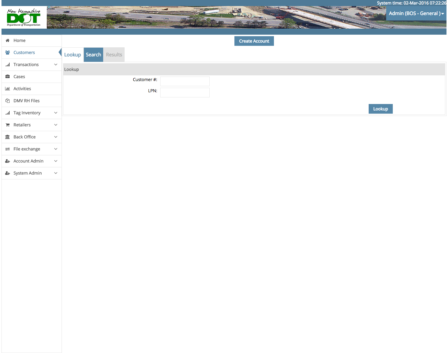
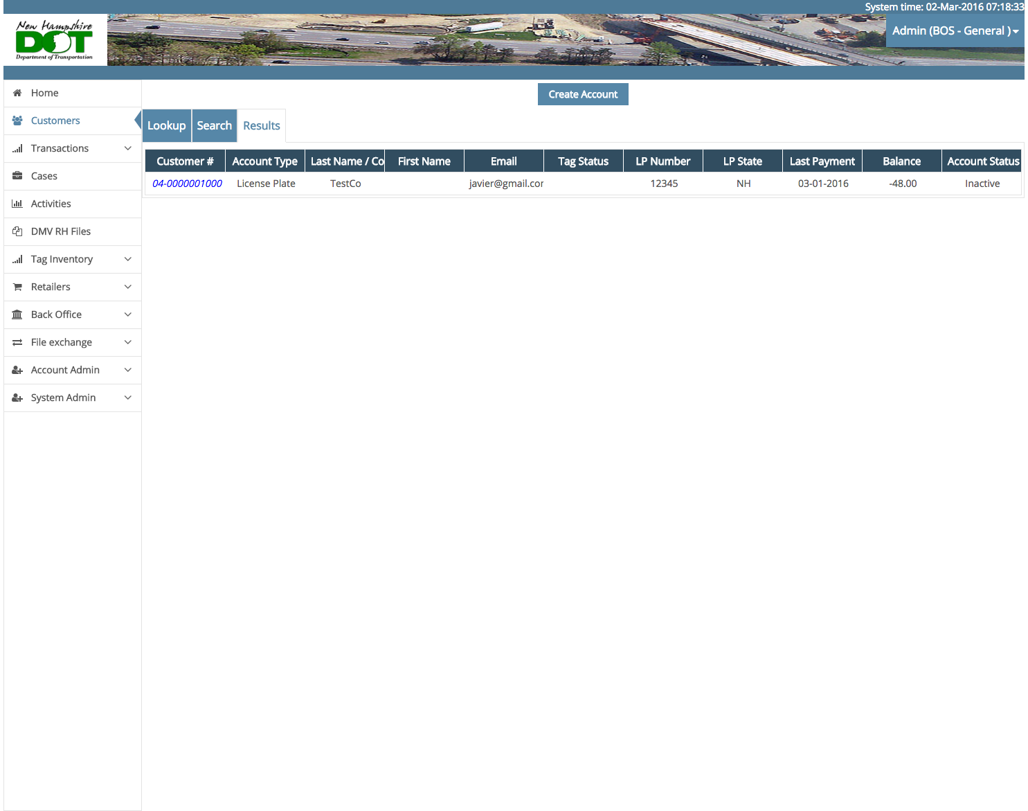
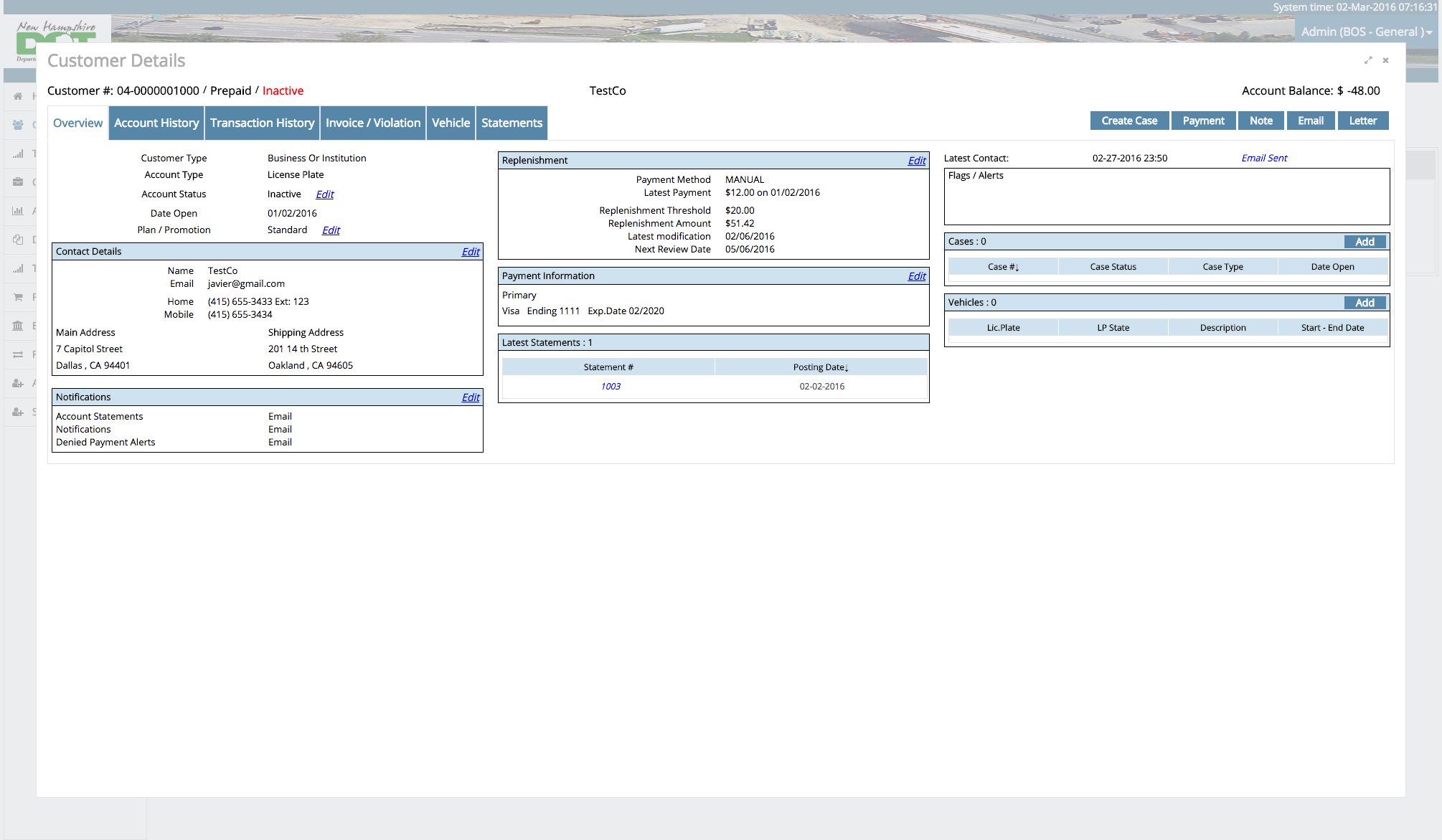
See below the pages as they were and the redesigns I proposed.
Original Screens
Proposed Layouts
