Gadget Guard is a manufacturer of protective films for a variety of smartphones and tablets. Their product was unique in the marketplace when it arrived on the scene and their company was soon acquired by Spring Mobile. I came on board in 2010, shortly after this acquisition to update and solidify their brand identity, produce marketing assets and a new website and design a new line of packaging for all their products.
Brand Development
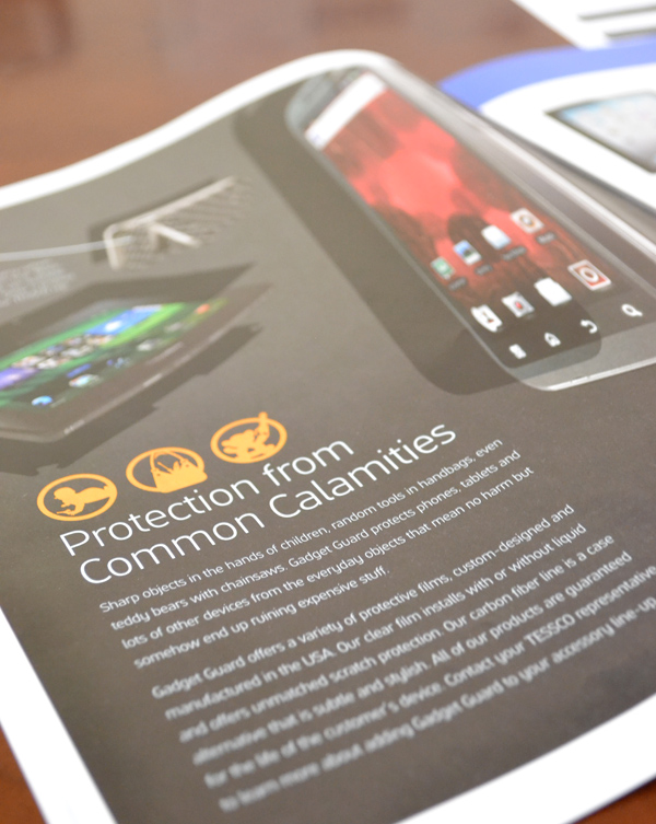
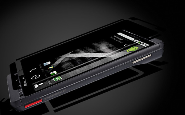
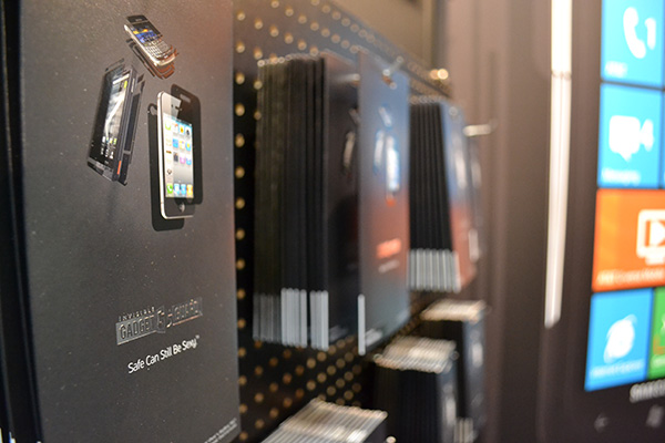
I revised the original logo, established brand guidelines, and designed a new method for producing digital product images using a device image and photoshop overlays to show the screen protectors. A clear piece of film cut into a distinct shape is difficult to capture with photography so this digital method allowed us to show the product much more effectively. I used all these new elements to create advertisements, pull-up banners, a trade show booth, retails displays and four different types of packages. Through my work the entire look and feel of the company was elevated.
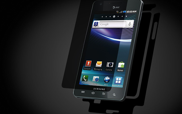
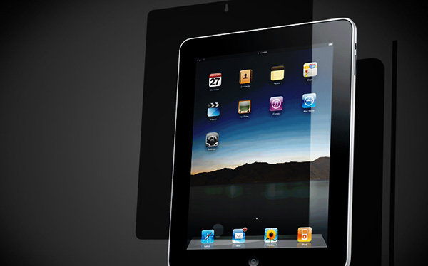
Product Images
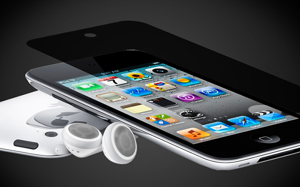
Unique product images were essential. I took the template for the actual film that would be cut out and used photoshop to skew it to match the angle of the device, then used a multiply filter to get a transparent look.
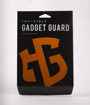
Logo Redesign
I liked the concept of the original logo – capital G’s forming a shield – but the way the colors were used made the inside of the second G stand out more than the actual G, which seemed confusing. I redrew the vector to create a single color logo that was cleaner with a bit more padding and no extra “Invisible” in the name. Sometimes subtle changes make a big difference.
![]()
![]()
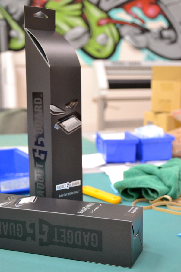
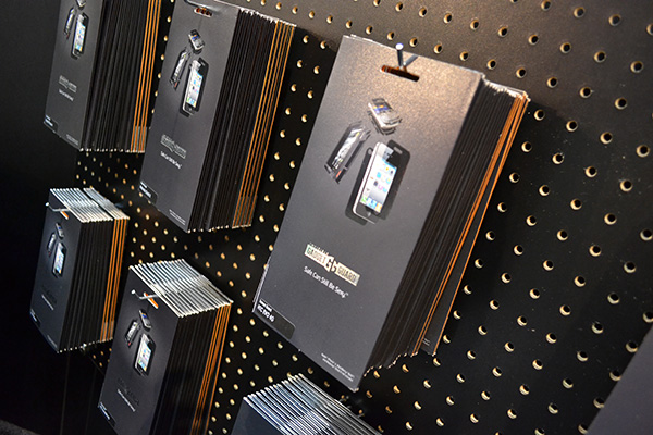
Packaging
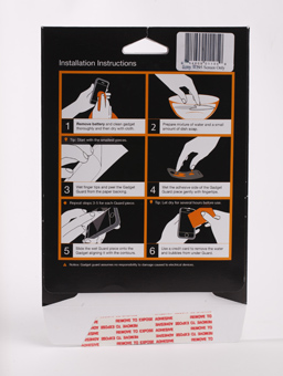
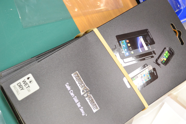
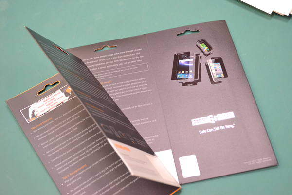
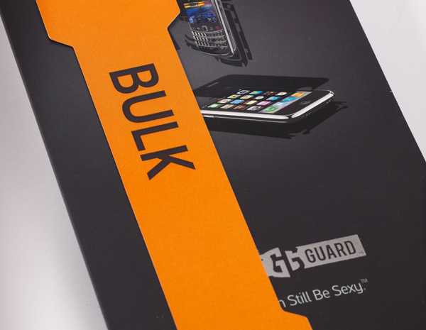
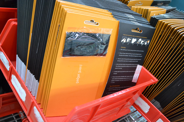
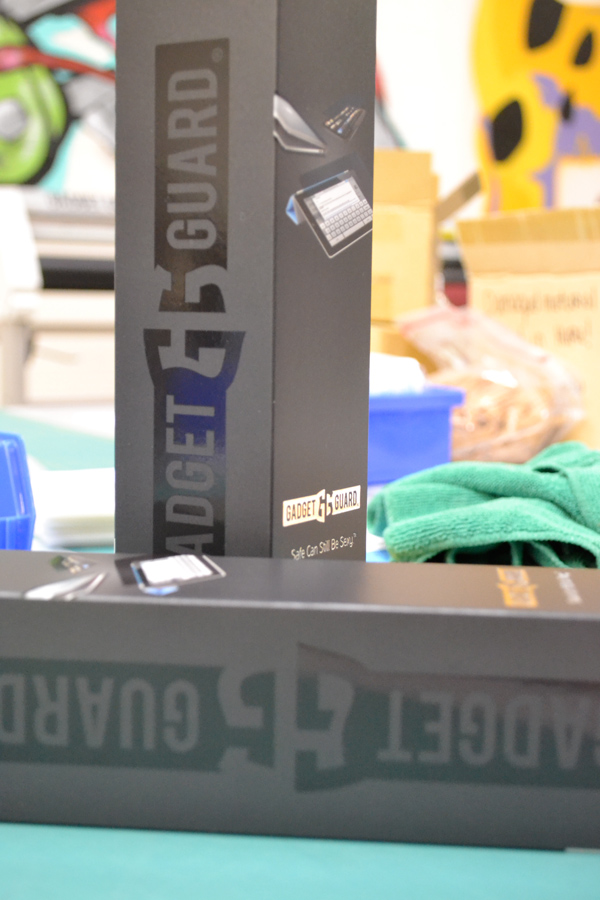
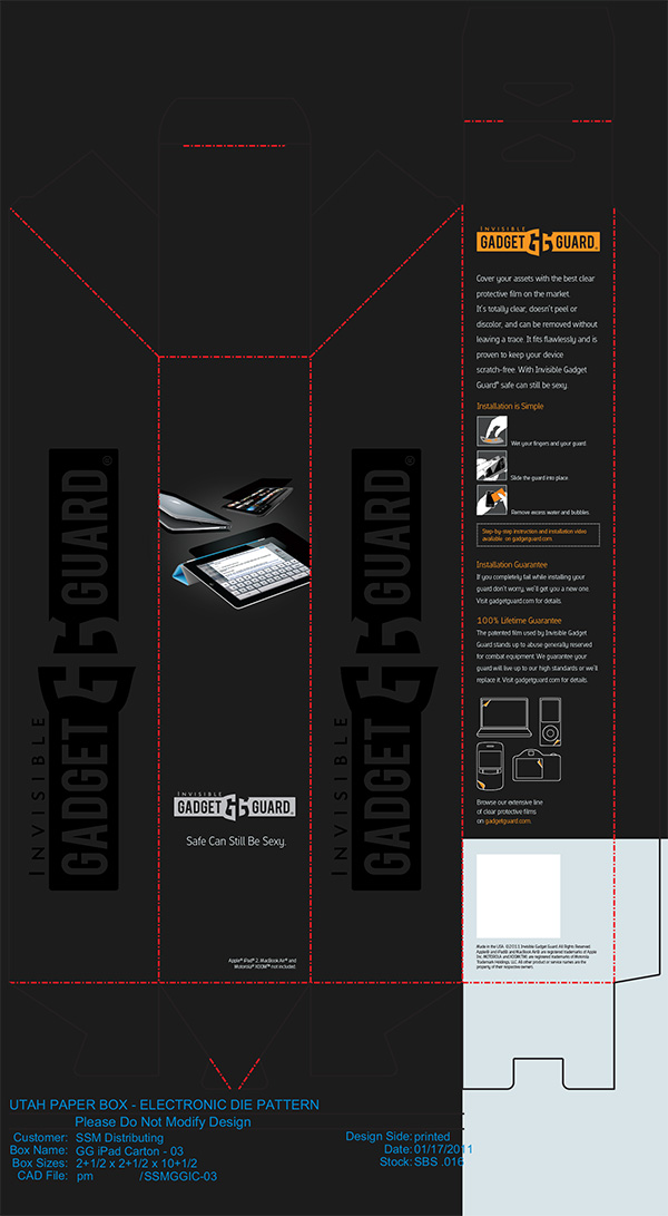
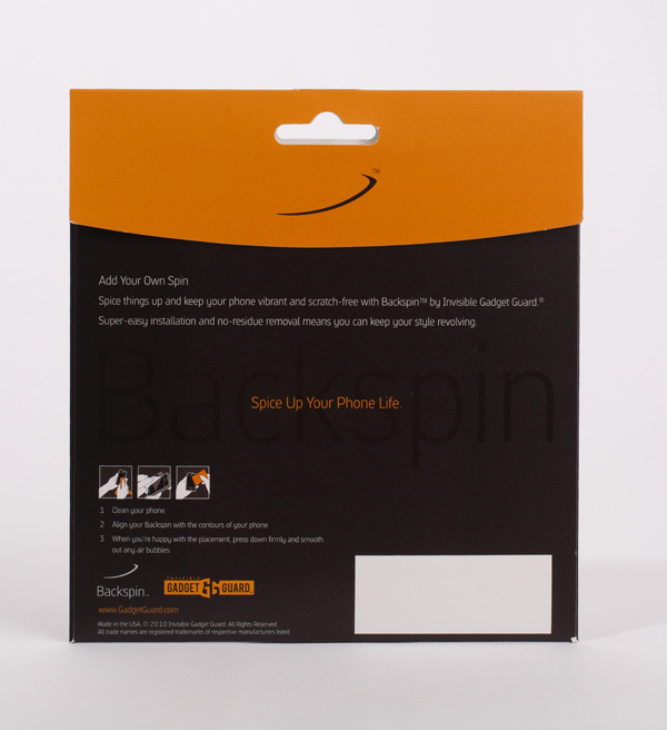
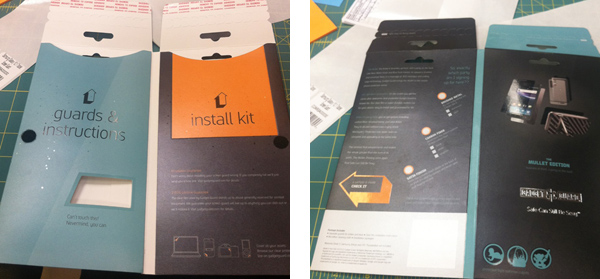
New packages were one of the first projects I worked on. The package had to include the film, an installation kit (microfiber cloth and mini squeegee) plus instructions on how to apply the film to a device. The original package was an envelope style that opened at the bottom. The new design was a folding booklet with a pocket on each side of the interior and a tamper-proof seal on the side. The logo and tagline were foil-stamped on the outside and a UV coating on the screen protector overlays made them stand out against the dark background. The instruction illustrations were updated and printed on the inside of the package.
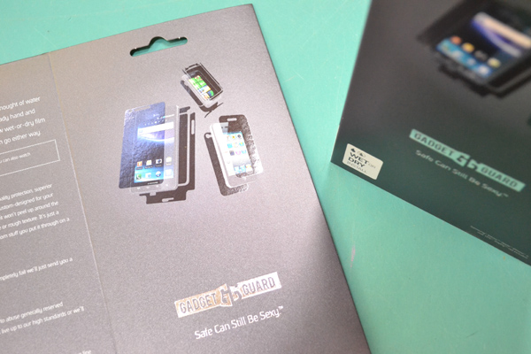
The original design didn’t tell customers much about the product at first glance. With the addition of product images it became much more clear what was inside the package.
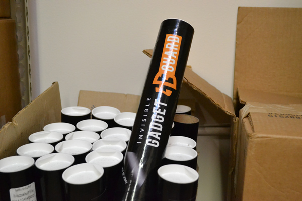
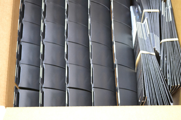
The next line of packages I designed was for iPad screen protectors. They were larger and rolled for shipping so we used a tall narrow box to replace the tubes that had been used prior.
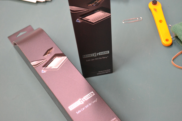
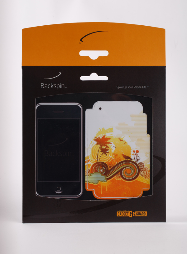
Gadget Guard launched two new product lines during my time with them and I created unique packages for these as well. One product line was protective printed films for the backs of phones, called “Backspin.” The Backspin package included a see-through window and was a different size than the other packages.
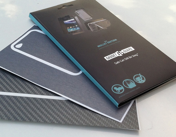
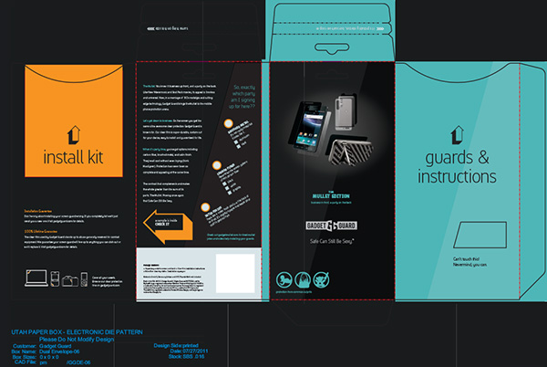
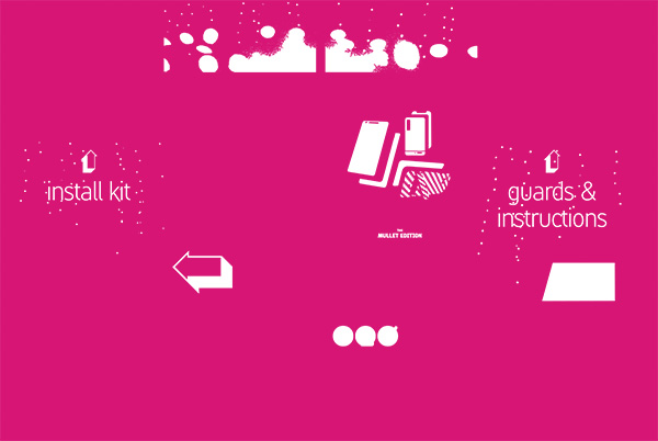
The other was a combination product that included a screen protector for the front and a carbon fiber film for the back, called “the Mullet Edition.” The Mullet Edition was a booklet form like the original clear film product but featured two top-loading pockets for the products and installation kit. This booklet form had a spine and different die line than the original. By sealing everything in pockets we could use a velcro closure that allowed the folding package to be opened without jeapordizing the products.
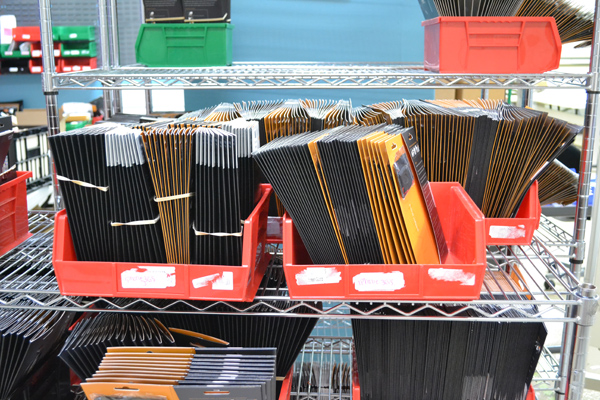
I worked with Utah Paper Box to create all the package forms and they did an amzing job with every production run.
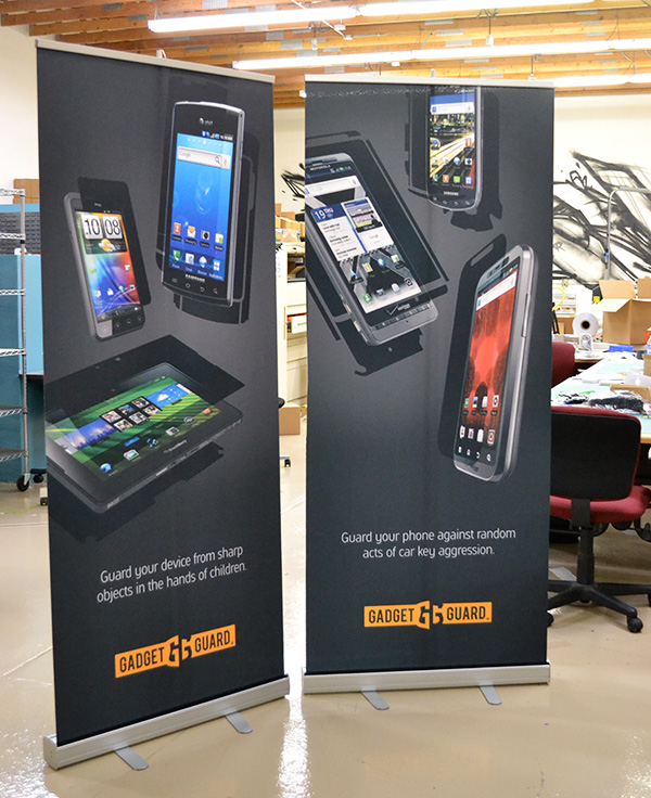
Pull-Up Banners
Pull-up banners featured the same dark background used on the packages along with huge product images, a simple, memorable piece of copy and the logo.
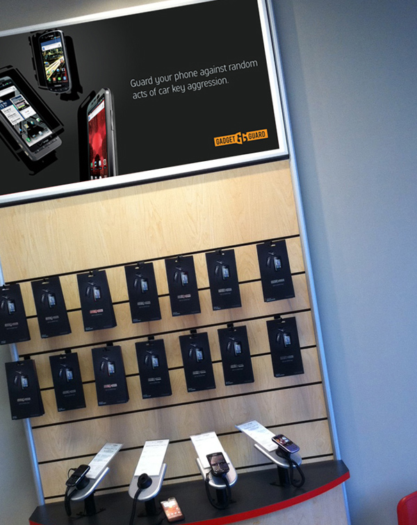
Retail Displays
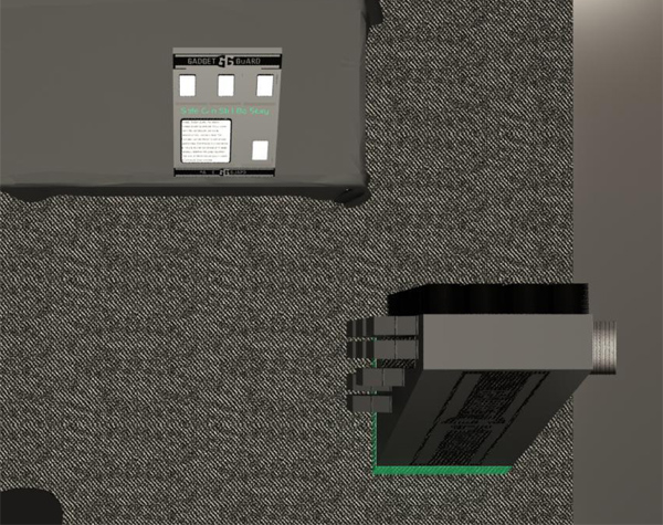
For in-store displays we created a few options. In carriers where there was a dedicated wall display we printed header banners to take advantage of the available space. For new carriers or stores that carried more than just mobile phones I designed two free-standing displays. One table-top display that showed examples of the product and another floor display that held products. Depending on the need and space each one could also be taken to trade shows or other sales events.
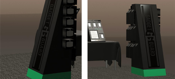
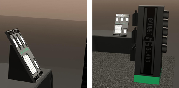
Tradeshow Booth
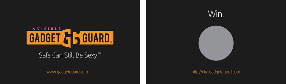
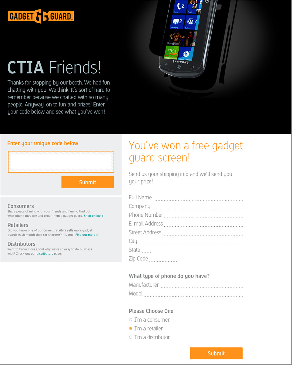
CTIA was the main networking event of the year for the company. I designed a trade show booth that would display products like they would appear in a store. The booth also featured gigantic phone images with the signature overlay treatment and a TV mounted at the end playing a promotional video. It’s always fun to see renderings come to life.
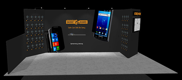
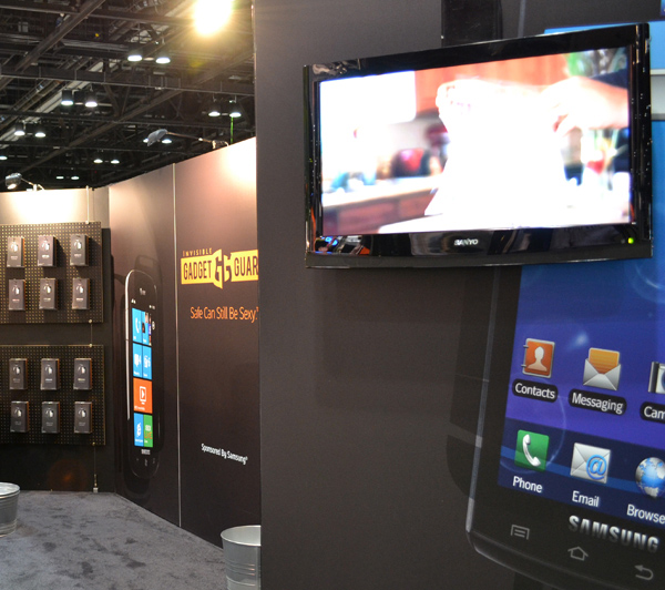
I designed a special promo page for the CTIA show and a scratcher contest to facilitate engagement with new contacts.
I had so much fun working with this brand. It was fast-paced but the team was always up for a new creative direction and they let me have a ton of freedom. They even paid for all the fancy packaging treatments I wanted – what more could you ask for?!