The challenge: create a brand and visual language for a new company in the supplemental insurance space, and design a landing page that would convey a complex and nuanced offering, in the simplest and most accessible way possible.
This project was a collaboration with Levver, an agency that drives revenue growth for B2B companies. Their client, Bridgecrest Advisors, had just formed and they needed a web presence fast. They didn’t have a logo or any marketing materials beyond a few Google docs describing their unique (and somehwat complex) offering in Oh-so-many words. Granted, some products take a lot to describe. They’re genuinely complex and require a lot of explanation. After talking with the team and getting an understanding of their product through their own words, I knew I could distill their message and make it more accessible to potential customers.
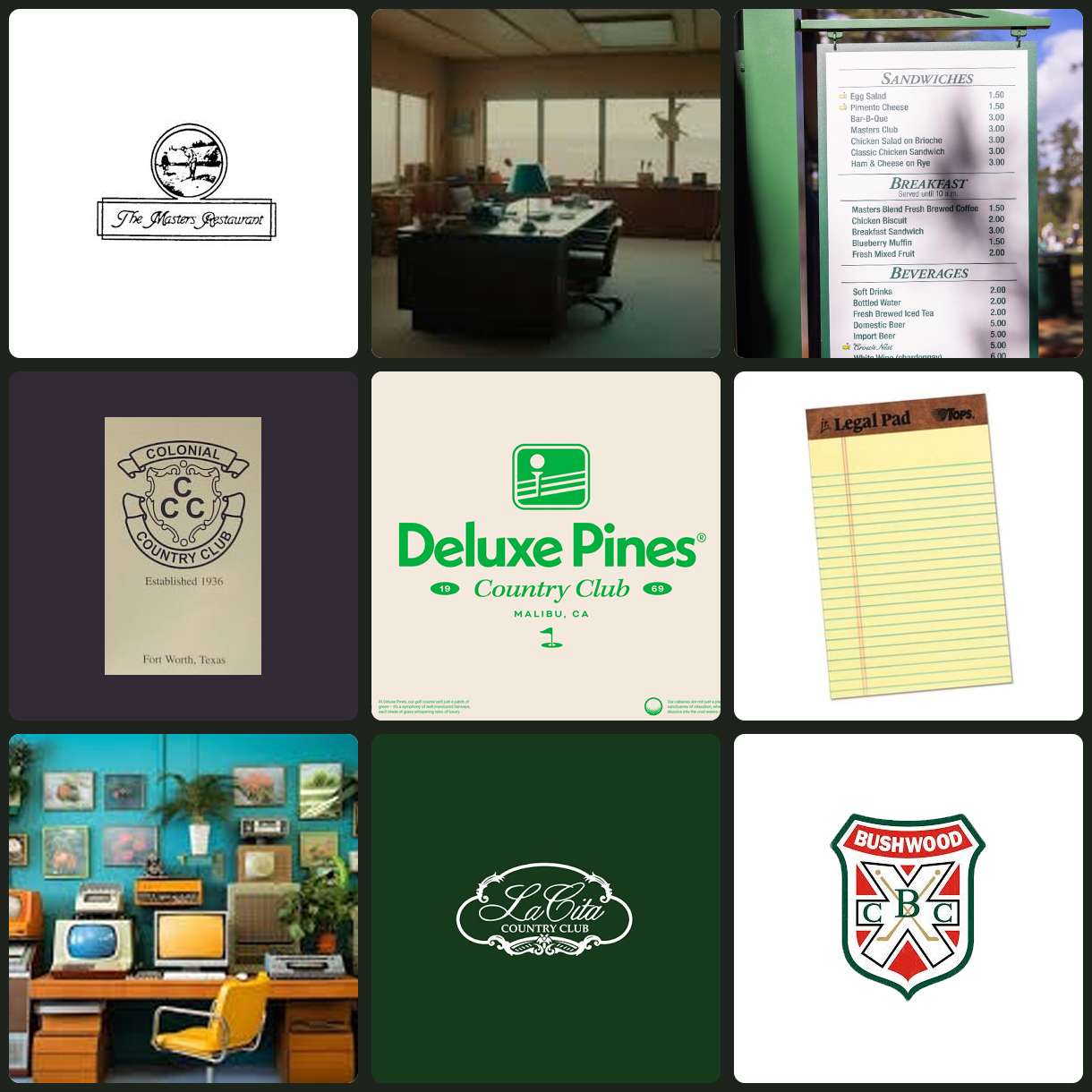
Andrew, the Founder of Levver, had a vision for the brand so I used his mood board to create the logo and visual language. Something “80’s country club with some retro tax advisor office vibes thrown in.” I went with it and we settled on a plaque style frame with all caps italics and a mountain crest to symbolize the apex of different goals intersecting.
From:
To:

![]()
For the website I needed to figure out a way to get straight to the most valuable benefits of the product and appeal to the CFO’s that Bridgecrest was looking to connect with.
I distilled a few pages worth of value propositions to a concise message that would get attention from a specific audience, namely business owners and CEO’s tasked with procurring health insurance for employees in a market where premiums are continually rising. These folks have to balance employee satisfaction with an expected benefit that rises in cost each year. I wanted to sum up the Bridgecrest offering in as few words as possible and pique interest to keep viewers scrolling down the page.
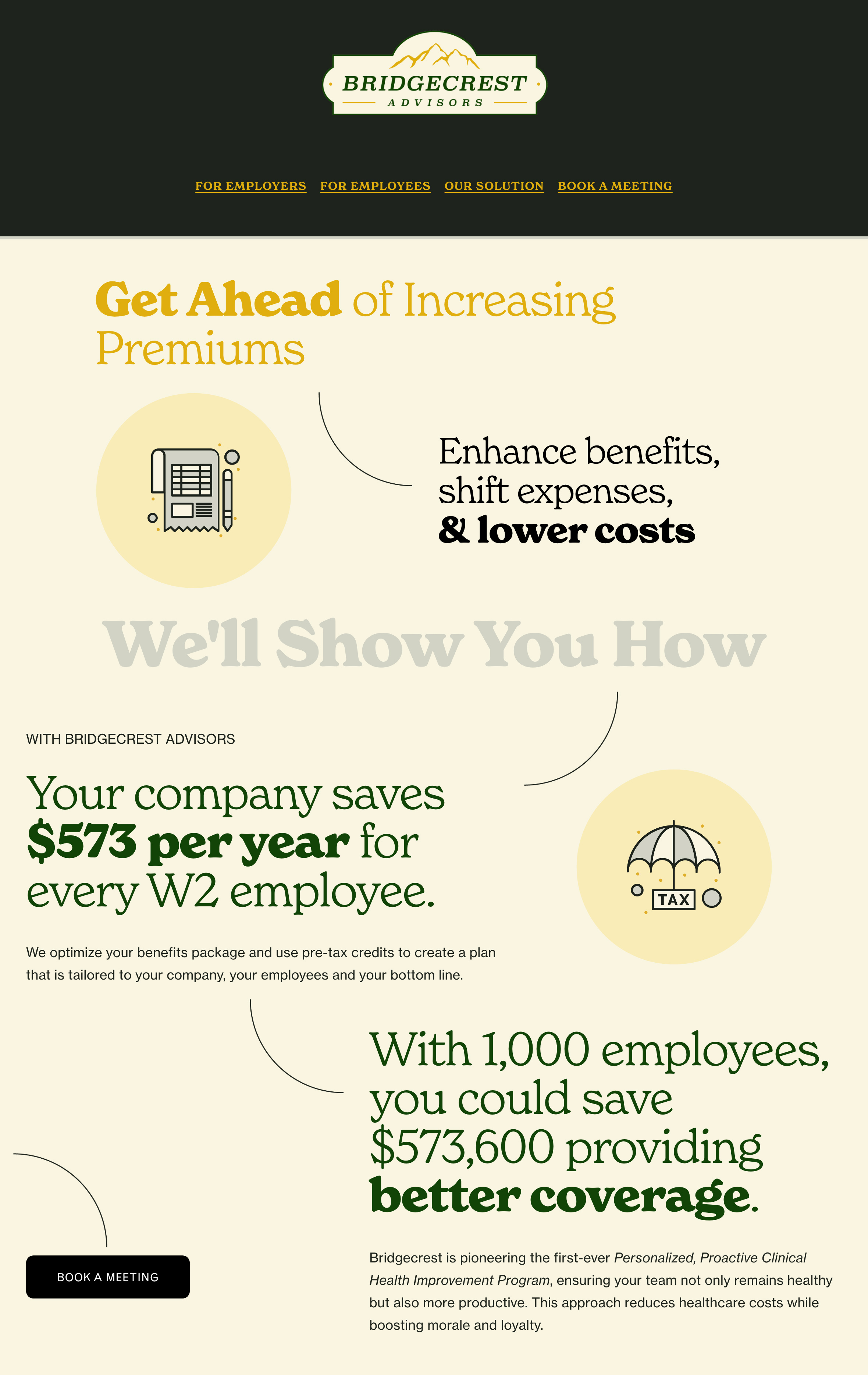
For visuals I chose large “friendly” text and curving lines that would lead the eye across the page to the next important message, like a flow chart. In this way viewers feel led through each section. Variation in color and size of the text plus supporting graphics and periodic calls to action keep the sections visually interesting with a balance of consistency and variation.
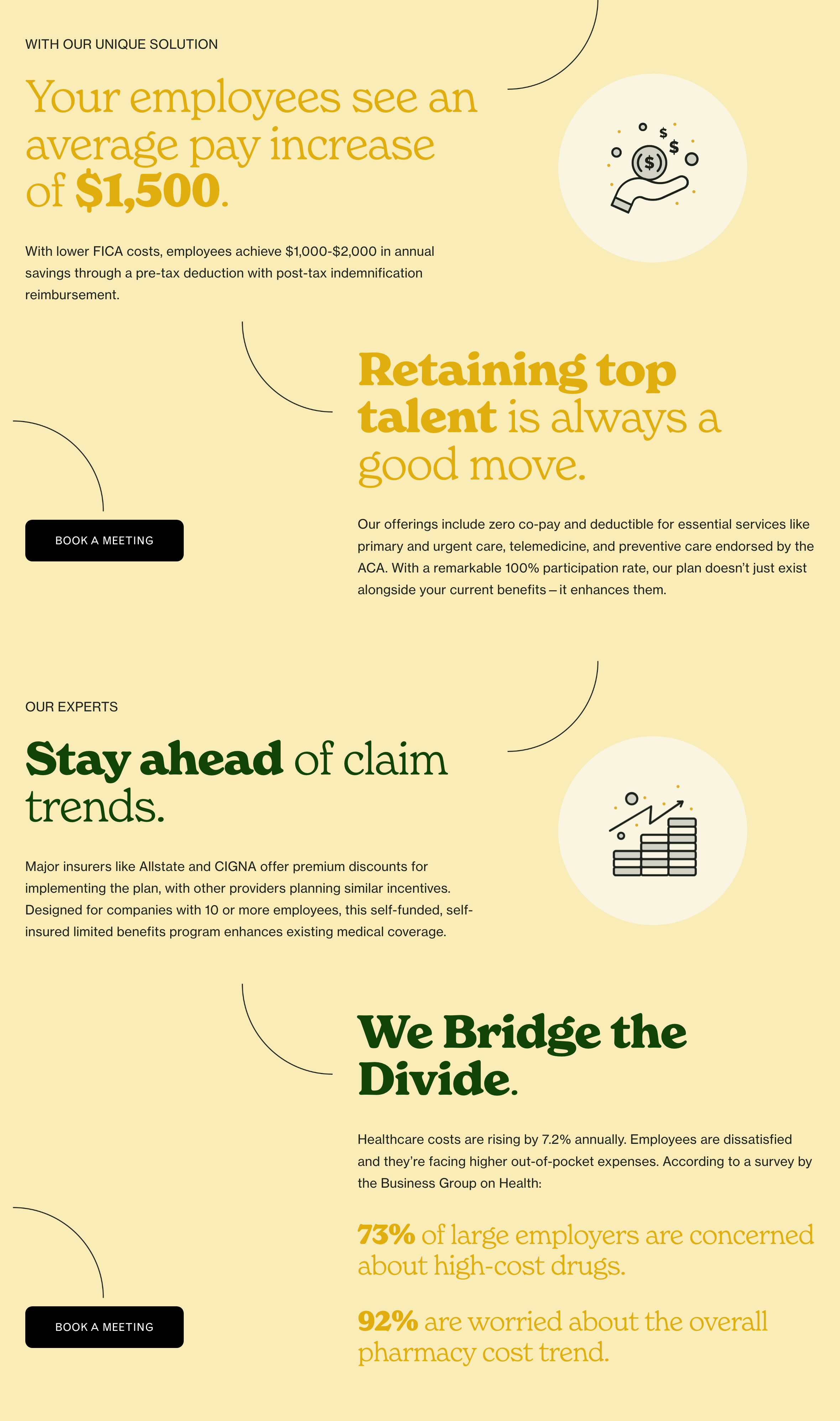
Very little of the text was taken from the original documents. I wanted to distill the message and focus on the most appealing benefits rather than ALL the benefits. That’s what the meeting is for.
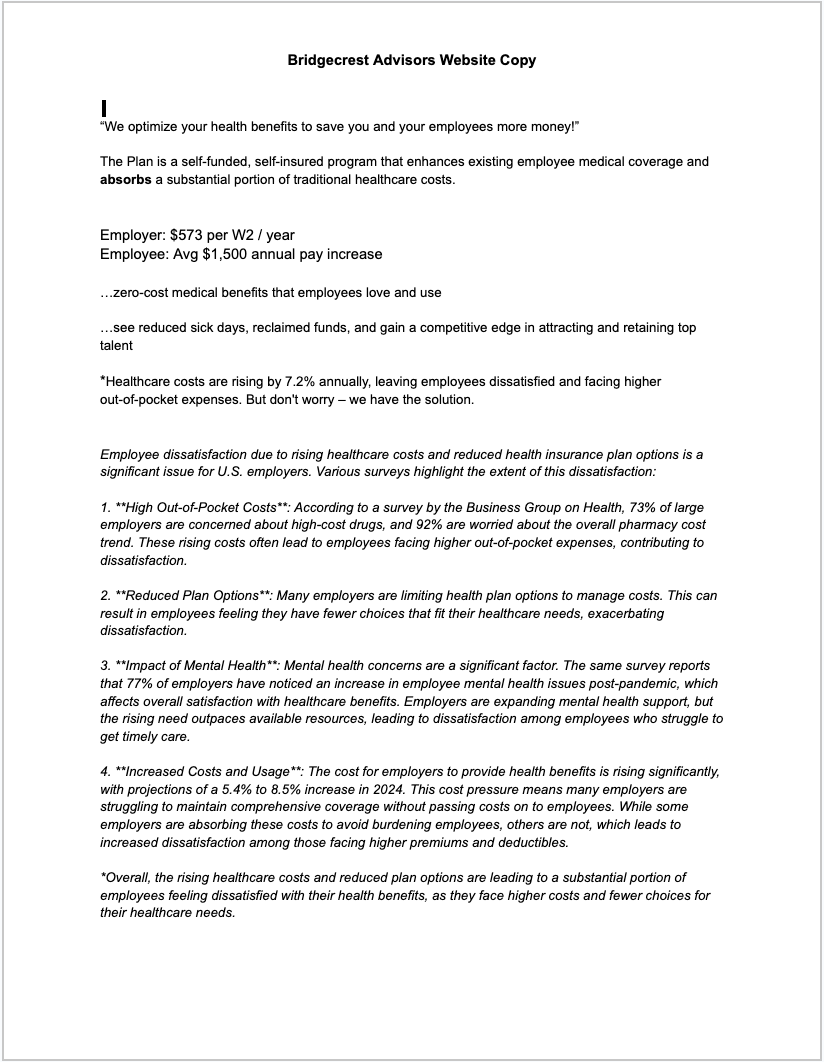
Honing in on “the message” is actually one of my favorite parts about creative consulting. When I’m given documents, I skim first, read second, then go through and see what grabs my attention most, what I think will grab the attention of the intended audience, then distill these points into succinct headlines with supporting descriptions.
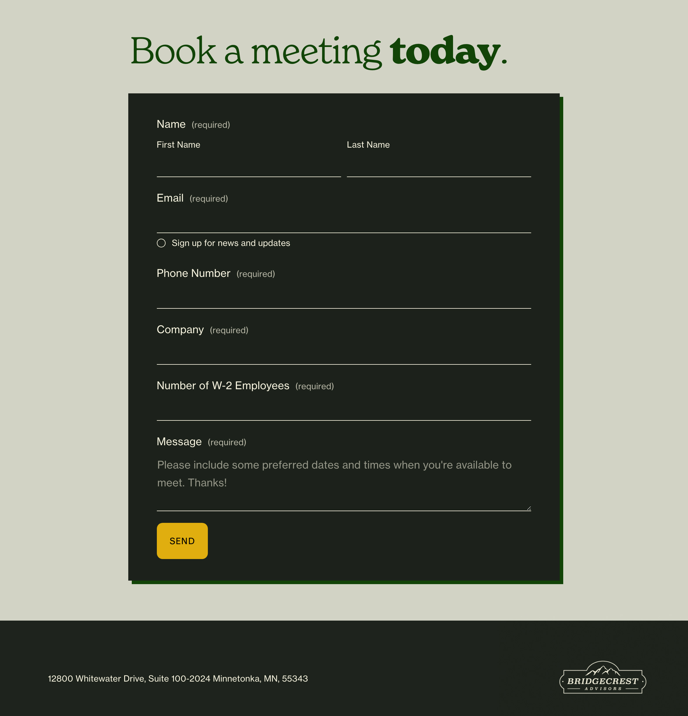
The result is an elegant landing page with personality that describes a complex offering in an accessible way. The client has a place to direct potential customers to get an overview of their product and schedule a meeting if they want to learn more. A nice color palette and a little editing go a long way!