A Unique Format
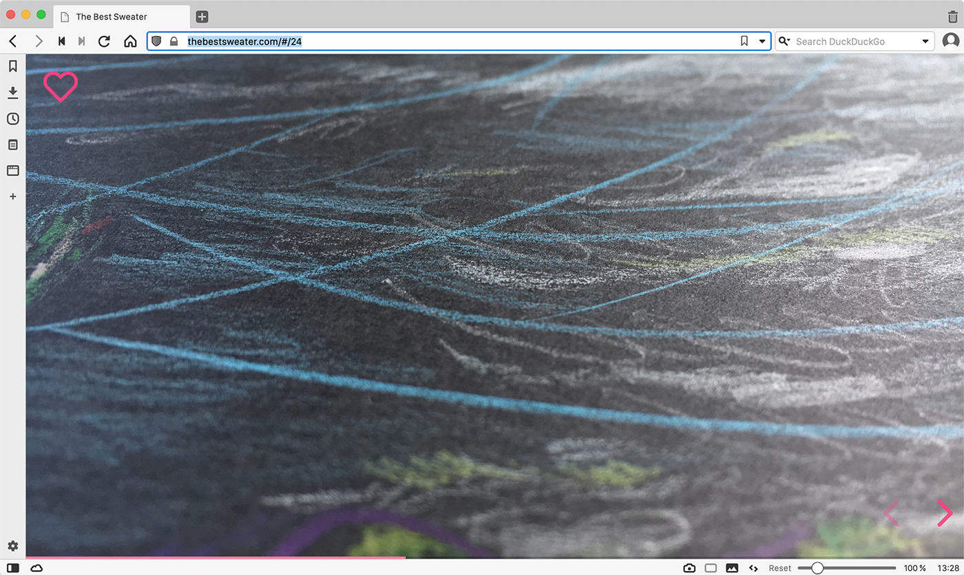
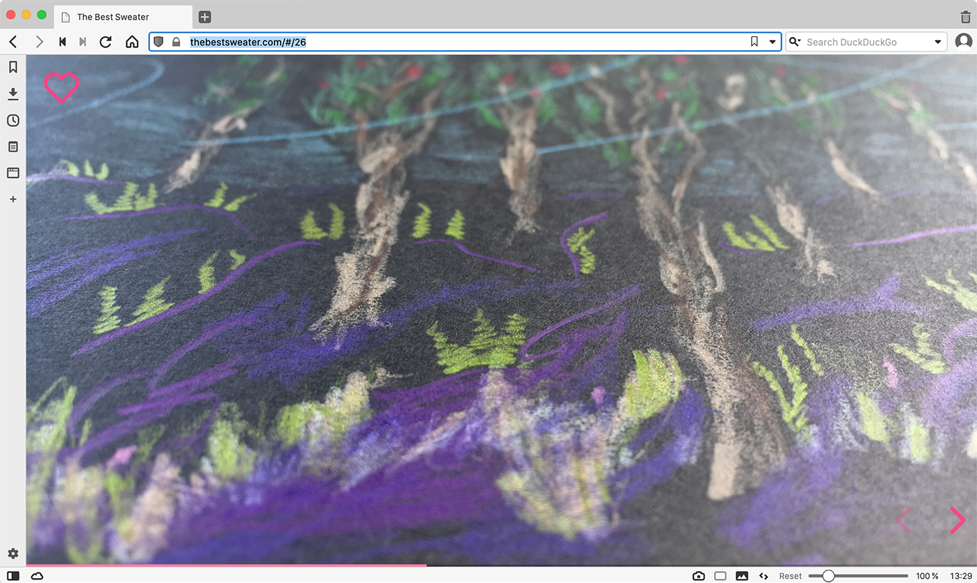
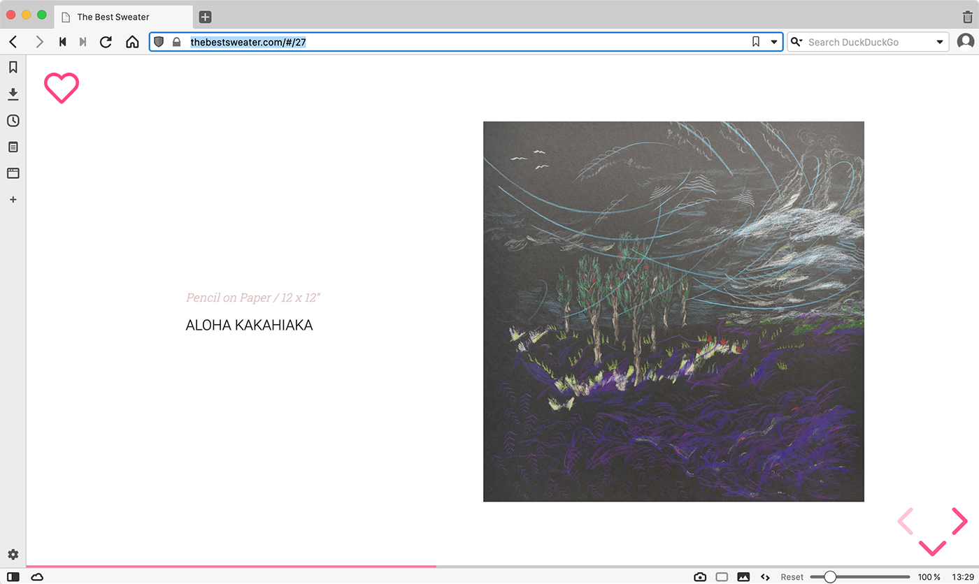
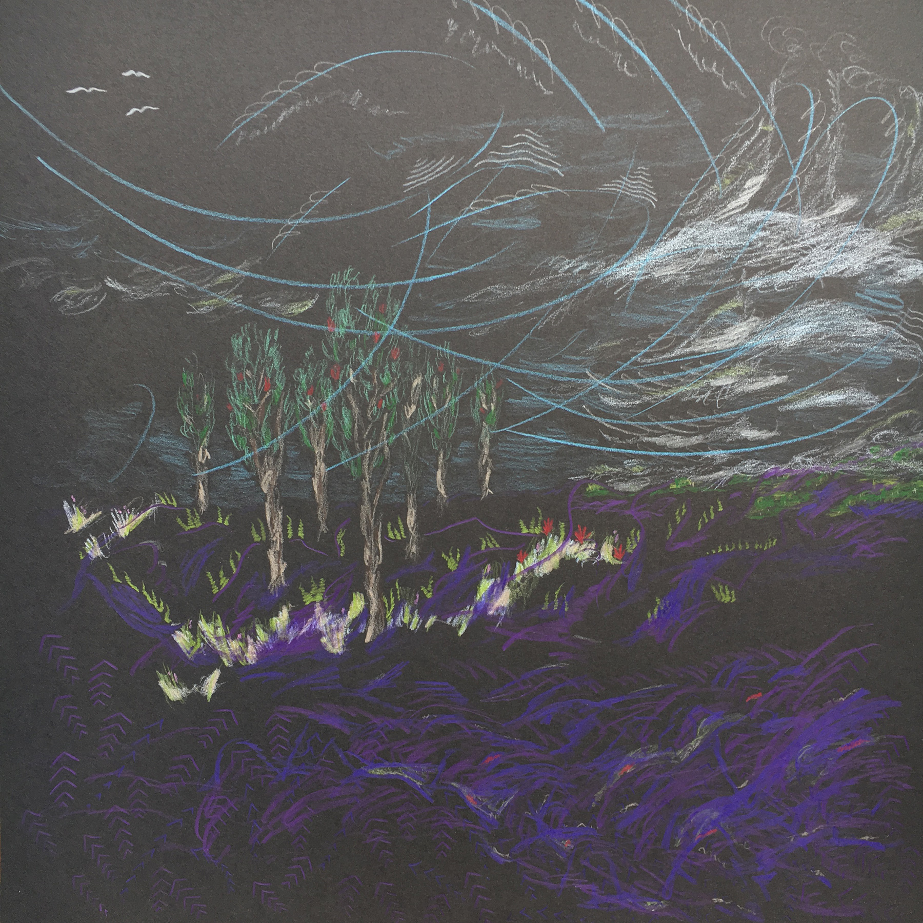
I wanted to translate the experience of moving through a gallery to an online showcase. By taking close-up photographs and displaying them full-screen, the texture and colors could be experienced more vividly.
The navigation is very minimal but still intuitive. The home icon (“home is where heart is!”) and a set of arrows in the lower right corner are the only persistent navigation. The home icon can be used anytime to return to the homepage and main menu of the site. From the menu users can choose a series of artwork to explore and navigate with the arrows, mostly to the right or left, as if walking through an exhibition. At the end of the series the menu is presented again. The up and down arrows only appear when there is more to see on an individual artwork slide. Going with a horizontal focus instead of a vertical one like most websites, each artwork or detail is on it’s own page with nothing more to see until the user is ready to move on.


Built with Hugo
This site is built with Hugo, a static site generator, utilizes the Reveal-Hugo theme (customized!) and is hosted on Netlify. Anymore all my personal sites are built with Hugo. It really is the fastest – and most fun – way to build websites.
A Streamlined Workflow
Whenever I make a new piece of artwork, I photograph it, transfer the files to my computer and size them in photoshop, add a new markdown file to my local site folder and push the changes to a git repository. Netlify pulls the updated version from git automatically and the new artwork is live.
Walk with me – fluffandjetsam.com
