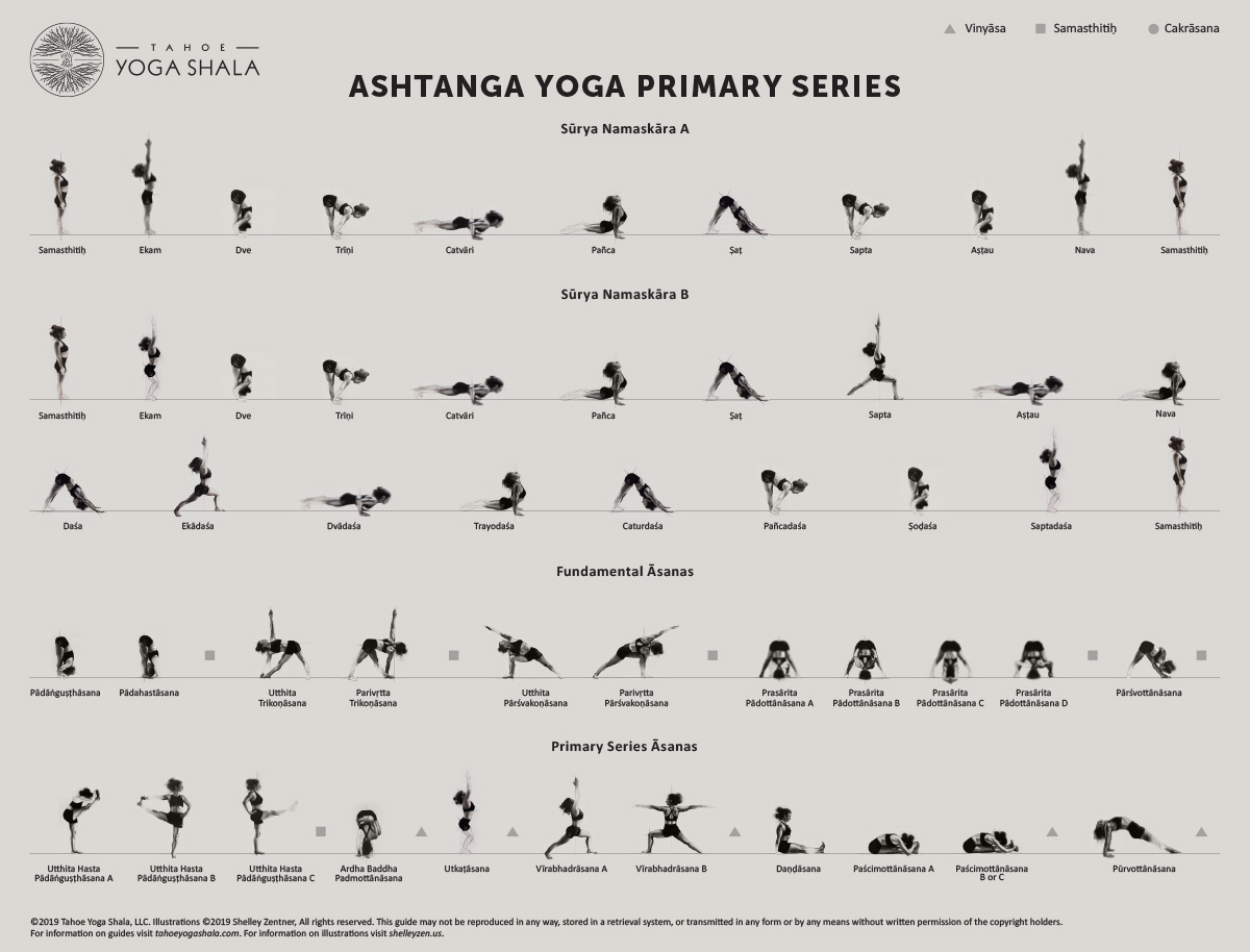
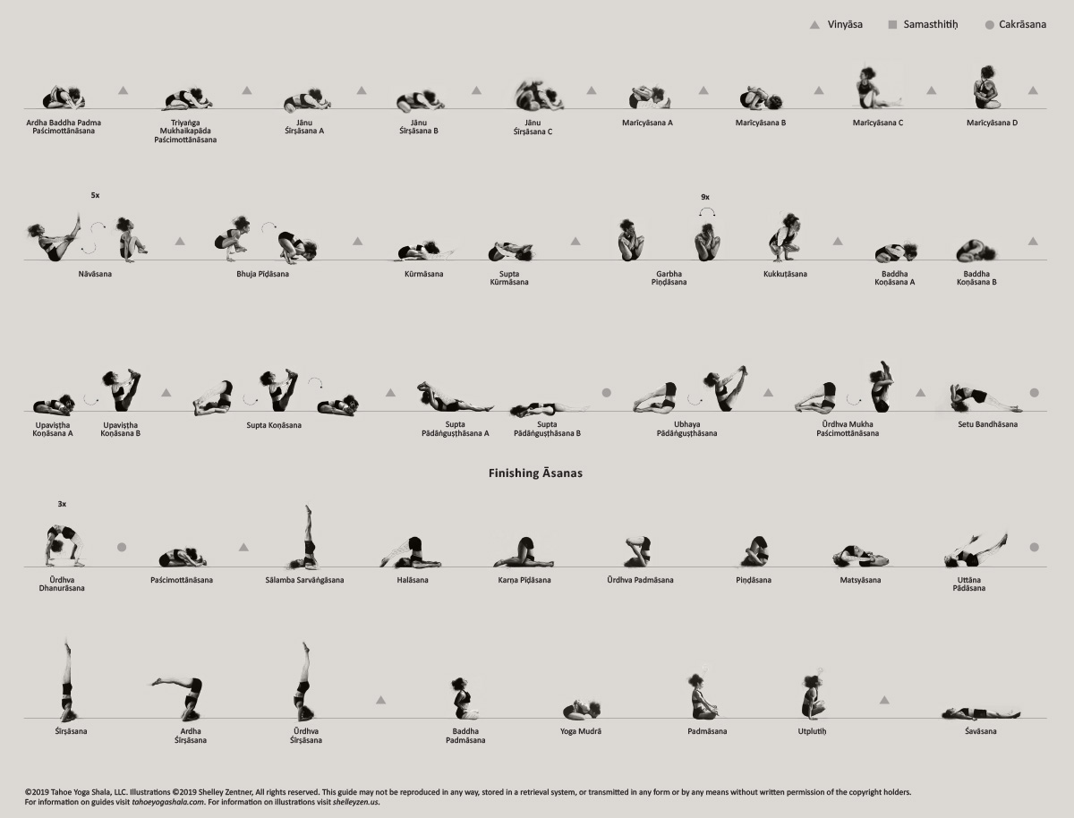
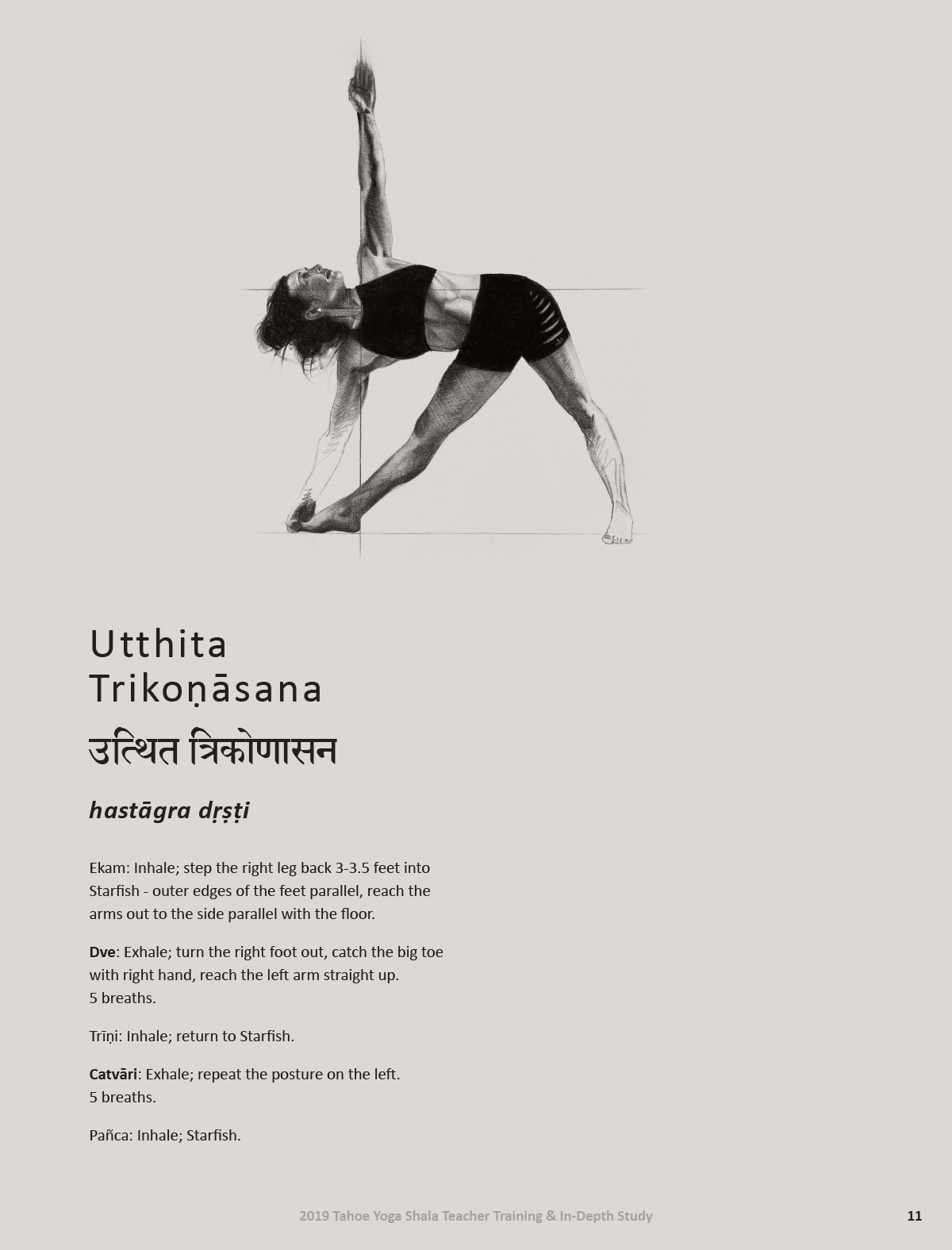
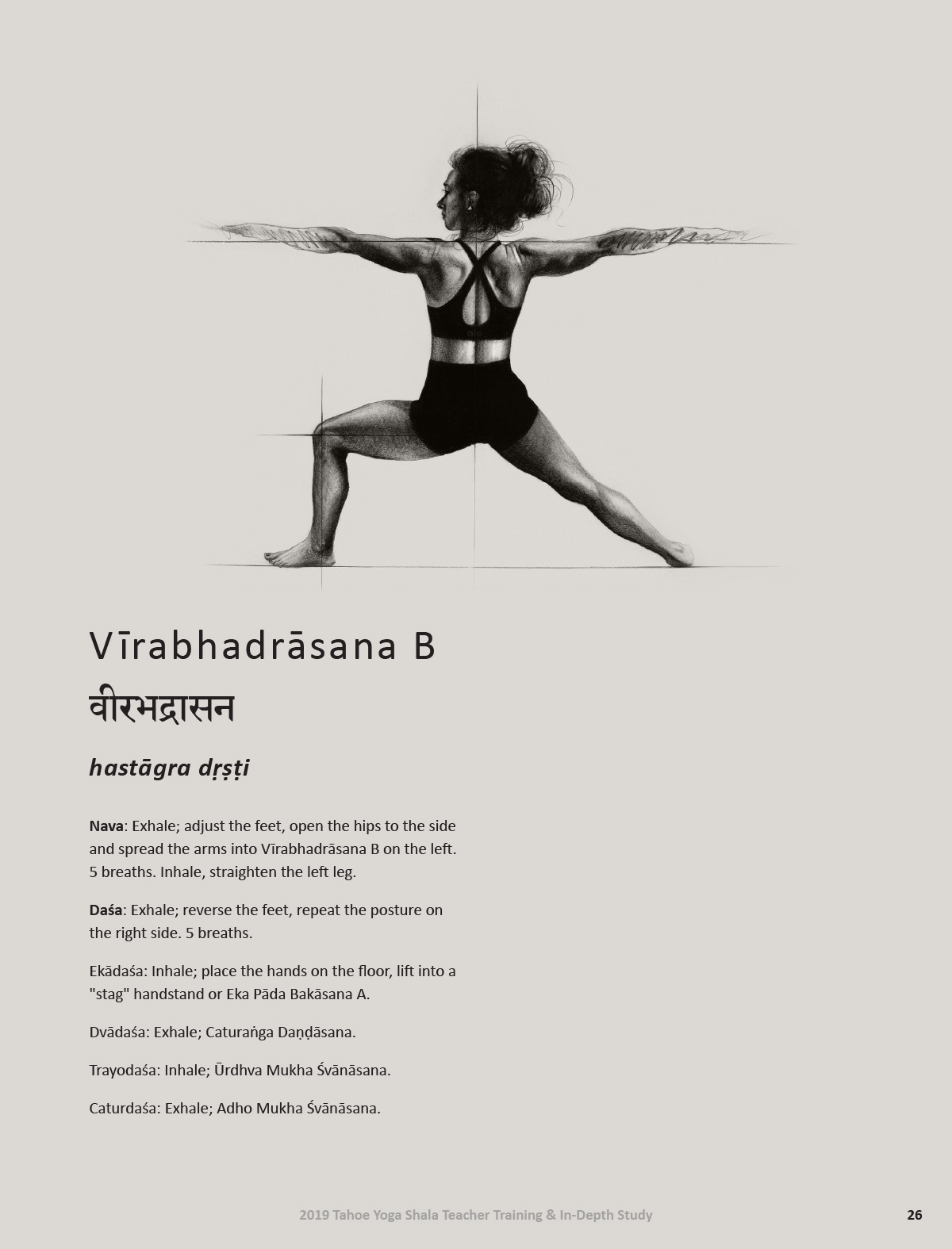
Welcome to most technically challenging print project I have ever dared to take on! Creating this series of training manuals was a labor of love, not only for me but also for my former yoga teacher, Laura, and the artist who volunteered to draw more than 70 different postures from the ashtanga yoga primary series – the awesomely talented Shelley Zentner.
Inspiration
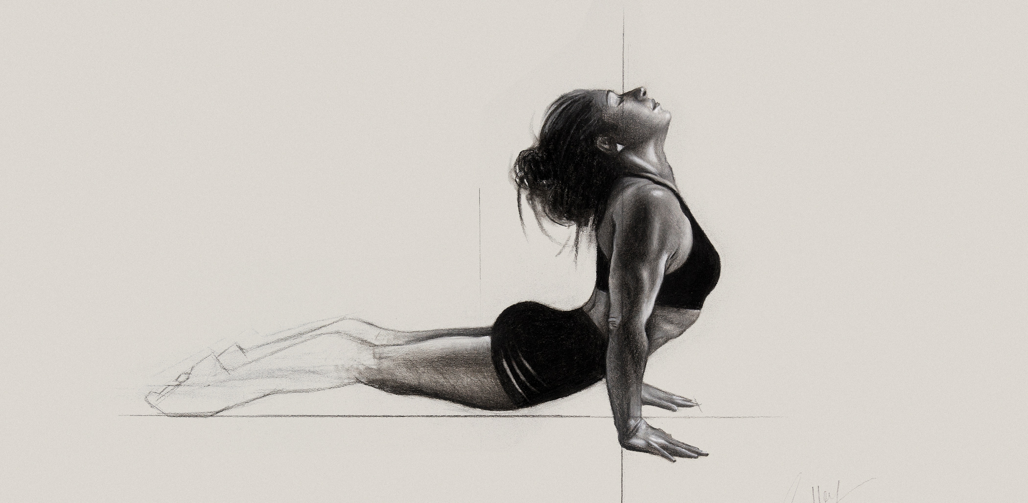
This project had been one of Laura’s pipe dreams for a while. She is an accomplished ashtanga style teacher in South Lake Tahoe. She holds regular teacher trainings emphasizing the Sanskrit names for poses, how to properly cue students and of course how to precisely embody each posture. She wanted to create an official training manual that honored the study and practice of the traditional ashtanga style of yoga. She and one of her students, Shelley, teamed up to create the most beautiful set of drawings of the poses I have ever seen.
Preparation
Laura posed for each one and Shelley poured months of love and techinal skill into the series. The original drawings were showcased at the studio and other galleries before they were digitized. Preparing copies for the manuals might have been more difficult than making them in the first place!
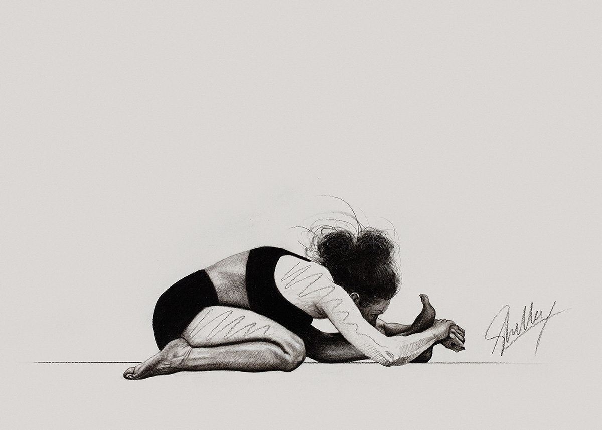
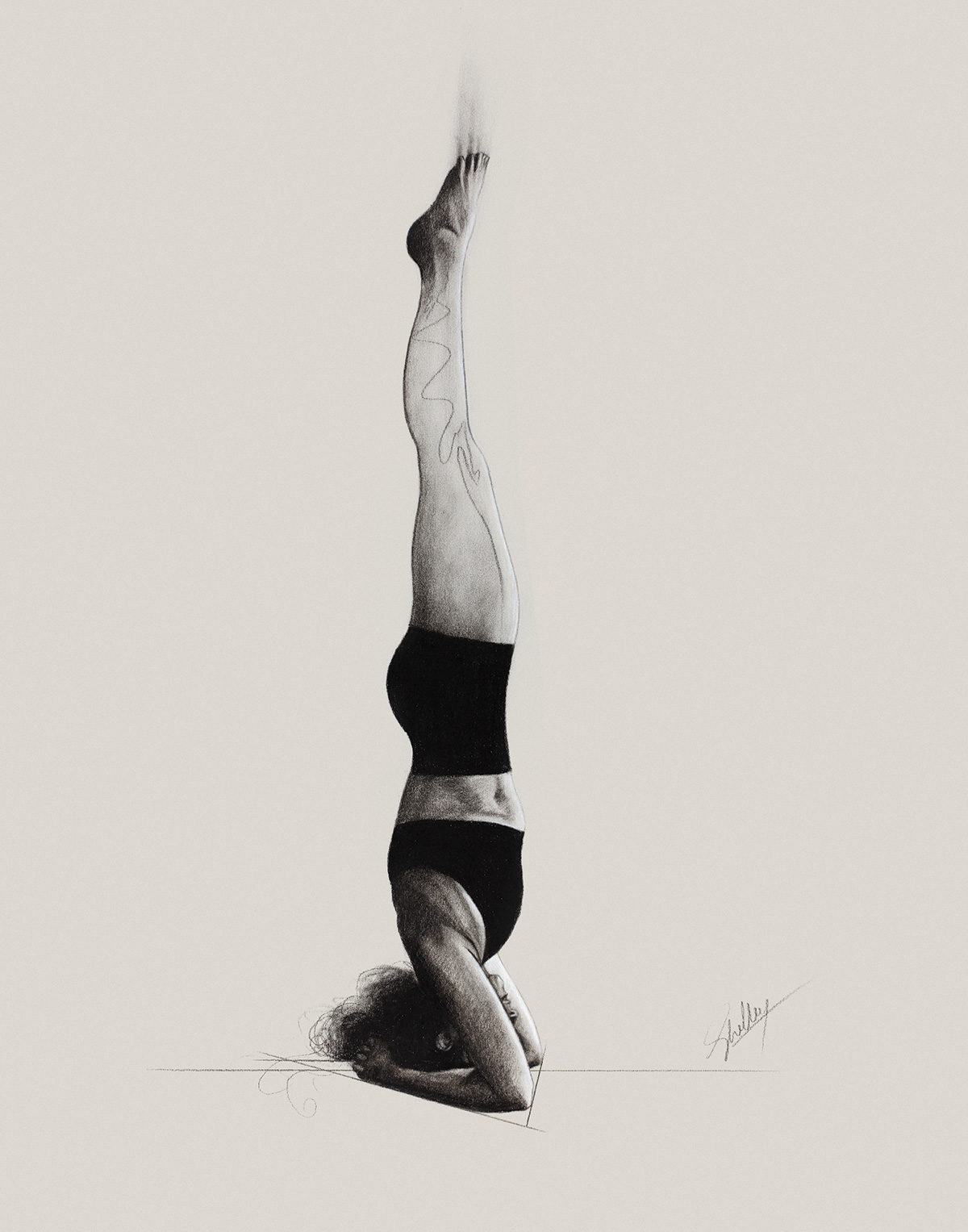
Design Process
We started with professional photos of the drawings but they were pretty muddy and Shelley had a hard time accepting the decline in quality from the originals. Halfway through the creation of the manual she commissioned large format scans of each drawing and we replaced all the images, being careful to fade the background from the scanned image into the background of the page.
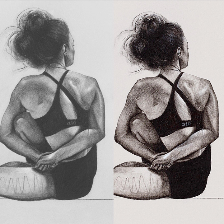
Keeping color consistent was accomplished both during the scanning process and during the design process. With so many fine and whispy lines we couldn’t isolate the images cleanly enough to put them on a white background. What we did was use a background color that was close enough to the majority of the backgrounds of the drawings and then feathered and faded our way to isolated images.
I have to credit my co-designer, Karly Tingey, with the brilliant photoshop method that allowed us to get all the varying color backgrounds to fade seemlessly together.
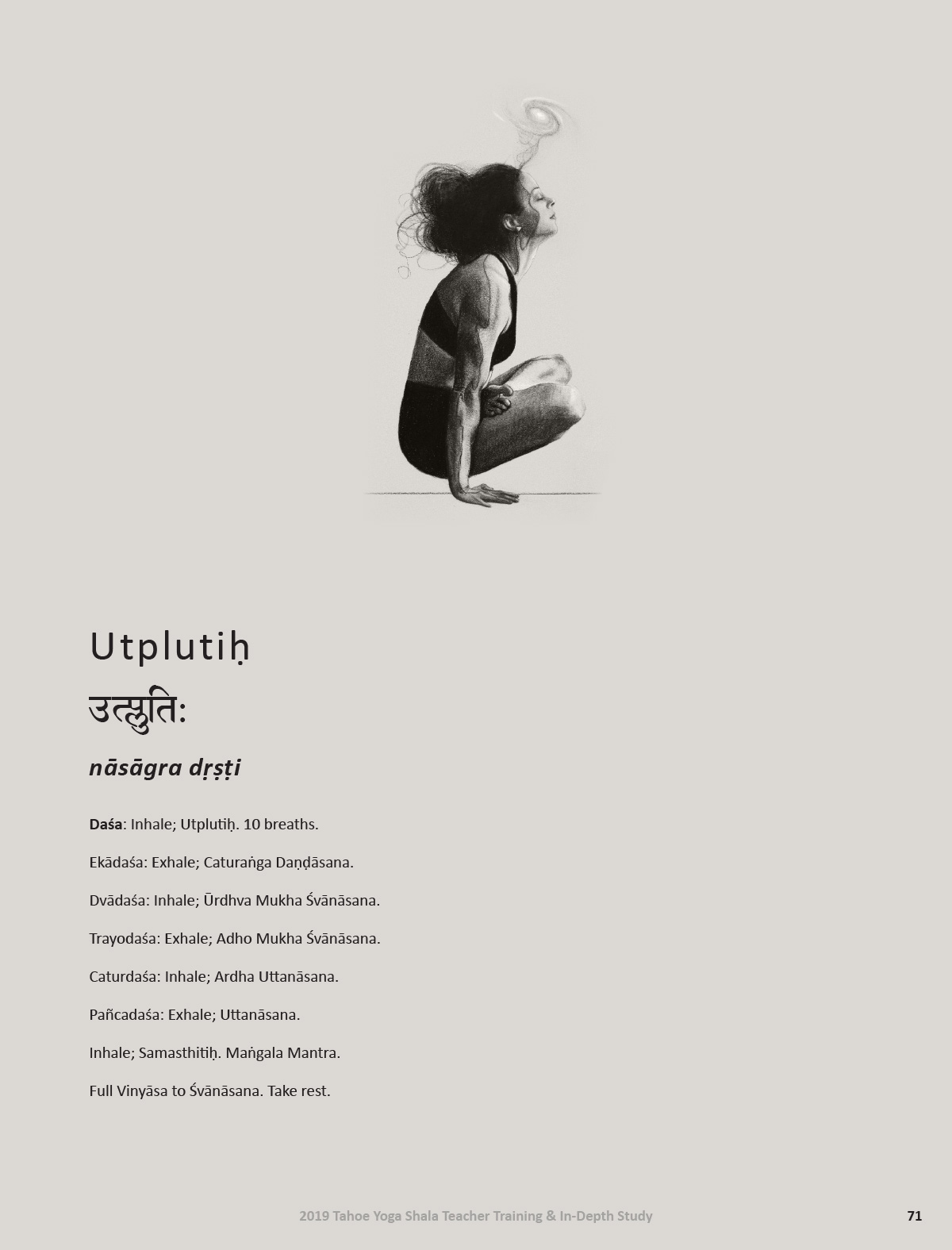
The page layouts were the easiest part of the process. The type was the hardest! Not only did we need a devanagari font that included the “shorthand” characters, we also needed an English font that supported all the accents and special markings. Calibri was the only font I could find that had enough ligatures so it was actually the only choice for the English!
In case you ever find yourself copy-pasting devanagari into Indesign and notice the characters changing and the words getting longer, fear not! Go to the paragraph settings and make sure “Adobe World-Ready Single-Line Composer” is checked. This will enable the shorthand characters to come through. That took me HOURS to figure out.
Editing
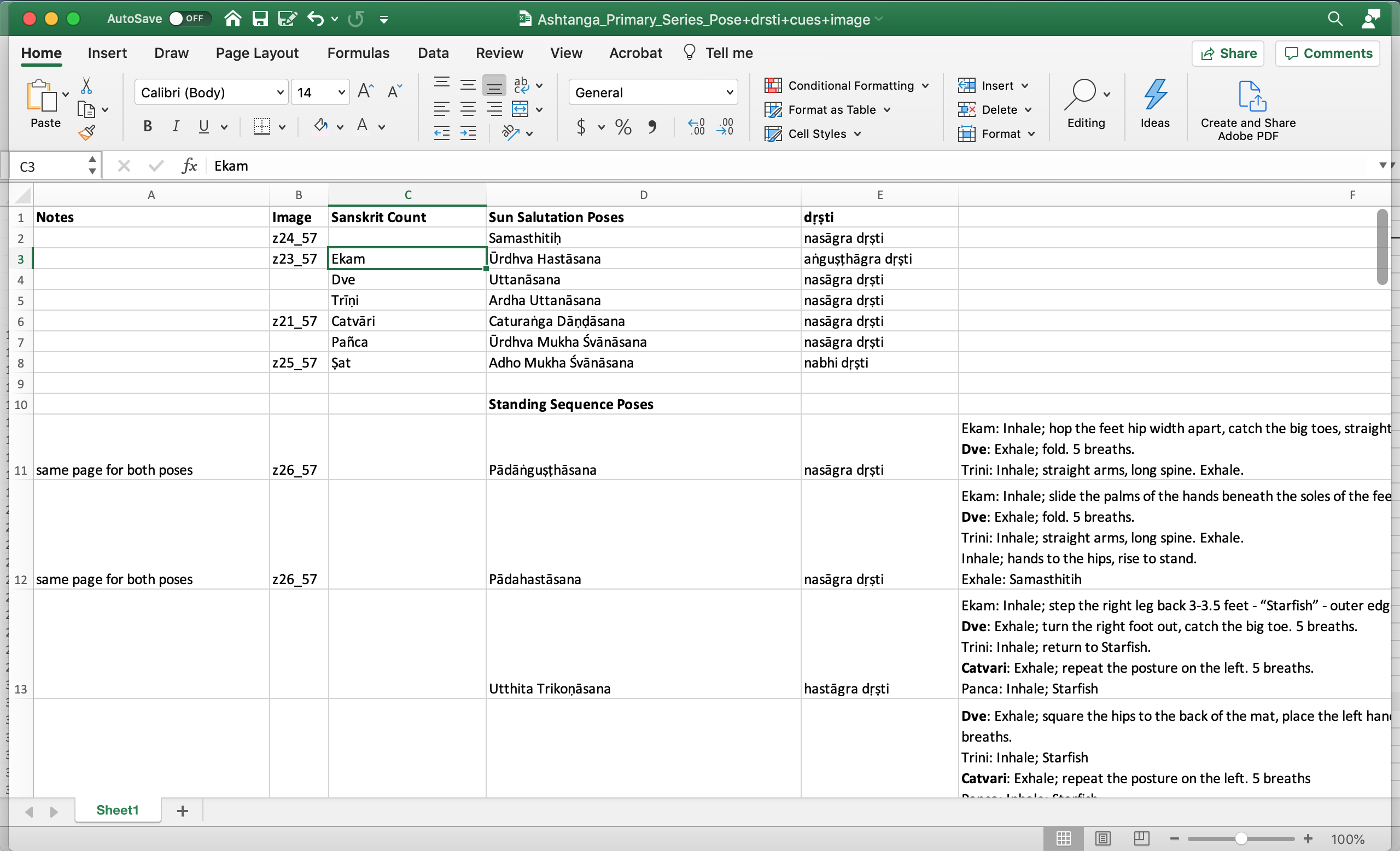
Once all the images and cues were in place we started on edits. With two languages to proofread and two Sanskrit experts reviewing each round we needed a reliable way to manage edits. I couldn’t even match the drawings with the pose names because they were all in Sanskrit. A spreadsheet saved the day as usual. We included the file name of each image, the name of each pose – in Calibri – the drsti (focus point for the eyes) and the full text of the cues. This way we could copy and paste as much as possible from excel to Indesign.
Final Assets
We ended up with quite a few final assets. There were Sun A & B cheat sheets, full primary series cheat sheets plus two finished manuals, one with cues and one without. Laura had the guides printed at a local shop in South Lake. They were bound with a simple spiral, which was effective for the training event but I secretly hope to print a fancier bound version at some point. I don’t think we’ll be tackling it anytime soon but there is an entire secondary set of poses, even more twisty and turny than the first! Yoga crowd likes a challenge. That may be why Laura and I love working together so much.
